Uncovering oneness and community in living and design.
Creating an identity and digital presence for Ubuntu, a residential project with a signature connected terrace and philosophy of living and thriving together.


Client
Sukhii Ubuntu
Industry
Real Estate
Duration
3 months
Year
2021
Scope of Work
Brand Identity
Publication Design
Digital Design
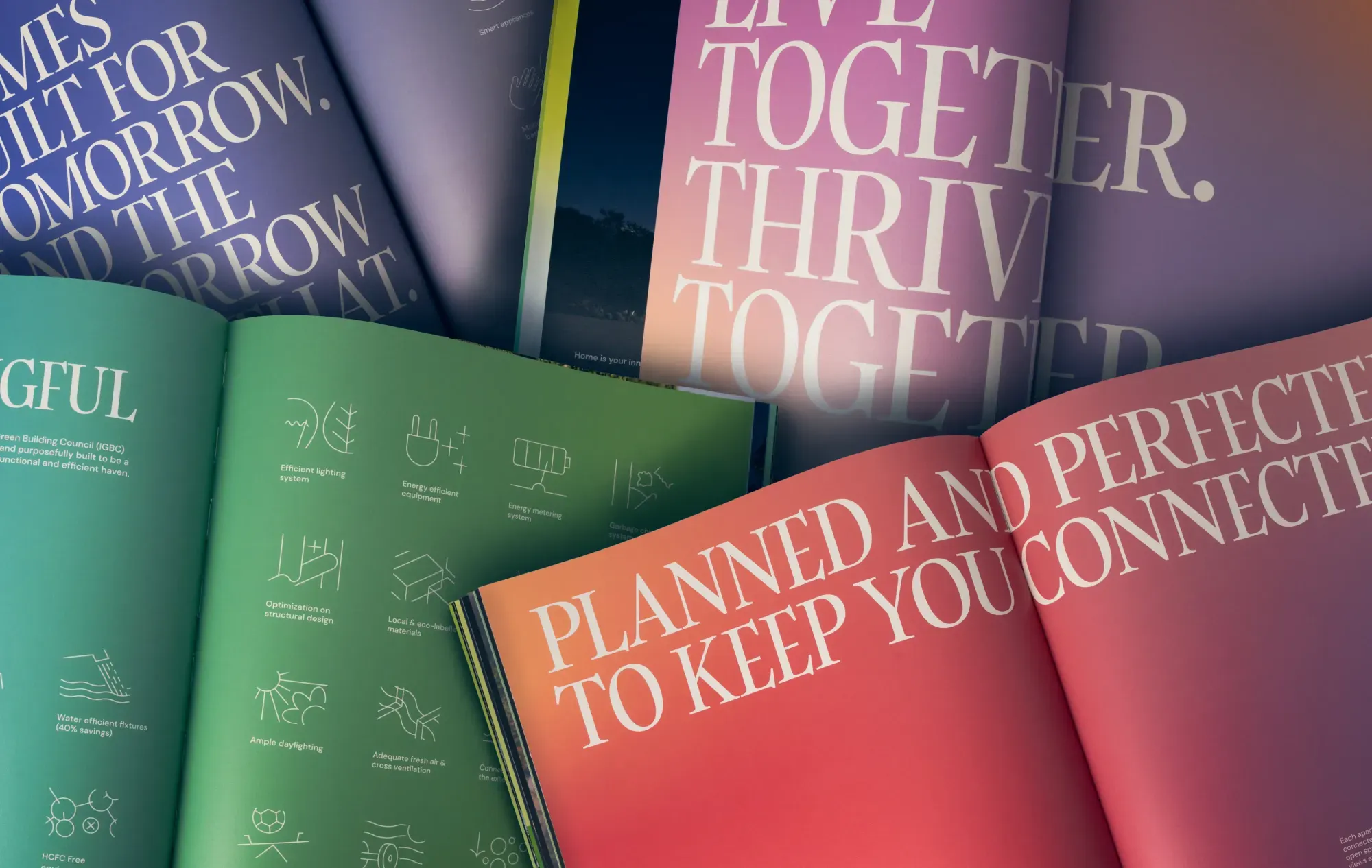
Saying community is one thing. Depicting it through design is another.
Ubuntu had its roots in African philosophy, with the name itself meaning “to bring you the oneness of humanity.” The project was built entirely around this concept and aimed to enhance the togetherness of its residents. Our design had to do just that and make the message even stronger.
Right from the logo design to the website and brochure, we incorporated elements that reflected this philosophy.
We aimed to bring across the message of joy, peace, unity, strength, and resilience being found through a community that shapes you, just as you shape it. We began with the logo.
Humanity
Towards
Others
Our simple but impactful logo showed oneness in the physical space - the three towers and the connected terrace they share - and the metaphorical.
Everything was then designed through a lens of joy, celebration, warmth and invitation towards this new life.


A palette inspired by the seasons
The greenery at Ubuntu was a core part of the structure's visuals as well as the sense of community it was building, and we decided to centre the project’s colour palette around this aspect. We used bright gradients of greens, yellows and oranges that conveyed the feeling of the changing seasons and the gradual evolution of nature over the year.
Primary Font
Secondary Font
.svg)

.svg)

A feel-good palette
These bright colours were complemented by secondary gradients using colours like blues, pinks, and purples. All bright. All happy. All welcoming.
Meaning through abstraction
The iconography we created was illustrative in a semi-abstract manner. They were designed to be used on a larger scale, containing details and patterns that set them apart from the usual kind of icons. Each of them was meant to be an illustration that could be used on its own or with other design elements across mediums, sizes, and contexts.


A holographic foil on the brochure cover reflected light to show a spectrum of colours that added a touch of magic and fun.
.webp)
.webp)

Bringing beauty to print
Our elements came together to create stationery and business cards that would be instantly recognisable as Ubuntu’s, and invoke a sense of calm to boot.


We believe that design should not only look good but also make a positive impact on people's lives.
Ubuntu’s digital home
The brochure’s design was incorporated into the sleek website, with elegant animations to enhance the user experience and bring out the message of oneness that was so integral to the project.


.webp)
What life at Ubuntu can be
The message of Ubuntu was one so full of joy and the promise of a delightful future that we wanted to depict it in a way that went beyond our design elements. We collaborated with just the right artist to create whimsical, aspirational, joyful illustrations of Ubuntu and the rich life that could be led there, all centred around our green palette. These immersive illustrations coupled with our rich design, layouts and renders made the brochure stand out and be memorable in a crowded real estate market.


With a vibrant visual language, bold typography, and a newfound interest in creating surprising iconography, we created a standout brand experience at every step - from brochure to stationery to website.
Ubuntu says “I am what we are.” And we are delighted to have branded this unique home.

Our collaborators for this project
Divya Ramesh
Copywriter
View profileFelix Roudier-Canler
Illustrator
View profile