Too cute to handle? We made sure this pet food brand turned the heads of pet parents across India

Redefining a category
With nuclear families increasing, pet adoption skyrocketing during the pandemic, and the millennial mindset of treating pets as important family members, the pet food industry had been seeing record highs. This meant more competition in the market, many of which had the advantage of legacy.
After establishing healthy snack and food brands for humans, Tanvi Foods had turned towards the pet food market, aiming to break the monotony existing amongst established brands.
Our challenge was clear. How could we make a pet care brand look luxurious yet fun at the same time? And at a time when brands like Pedigree and Drools are household names, how could FiloMilo make a lasting impression?

Barking up the
right tree.
This project was an exercise in creativity and cuteness, but it was fuelled by the love for animals that the founders of FiloMilo had in abundance. Doesn’t looking at these packs make you smile? That’s all the affection FiloMilo has for your pet, and we had for them.
Naming that pet (project)

We first sat down to name the brand in a way that stood out from the others in the market. Right off the bat, we vetoed any approach that had “pets”, “dogs” or other obvious anatomical or behavioural references. Instead, we gave it a more personal touch.
We looked at actual pet names, and saw that Milo was one of the most popular names for man’s best friend. We then arrived at the name FiloMilo, using the rhyme to bring a casual, vibrant and fun vibe to the brand.
The Wordmark


A colour palette that
breaks through the clutter
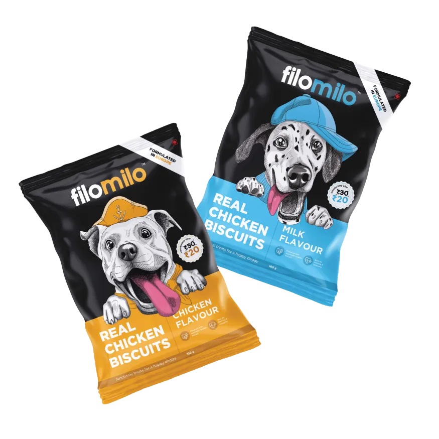
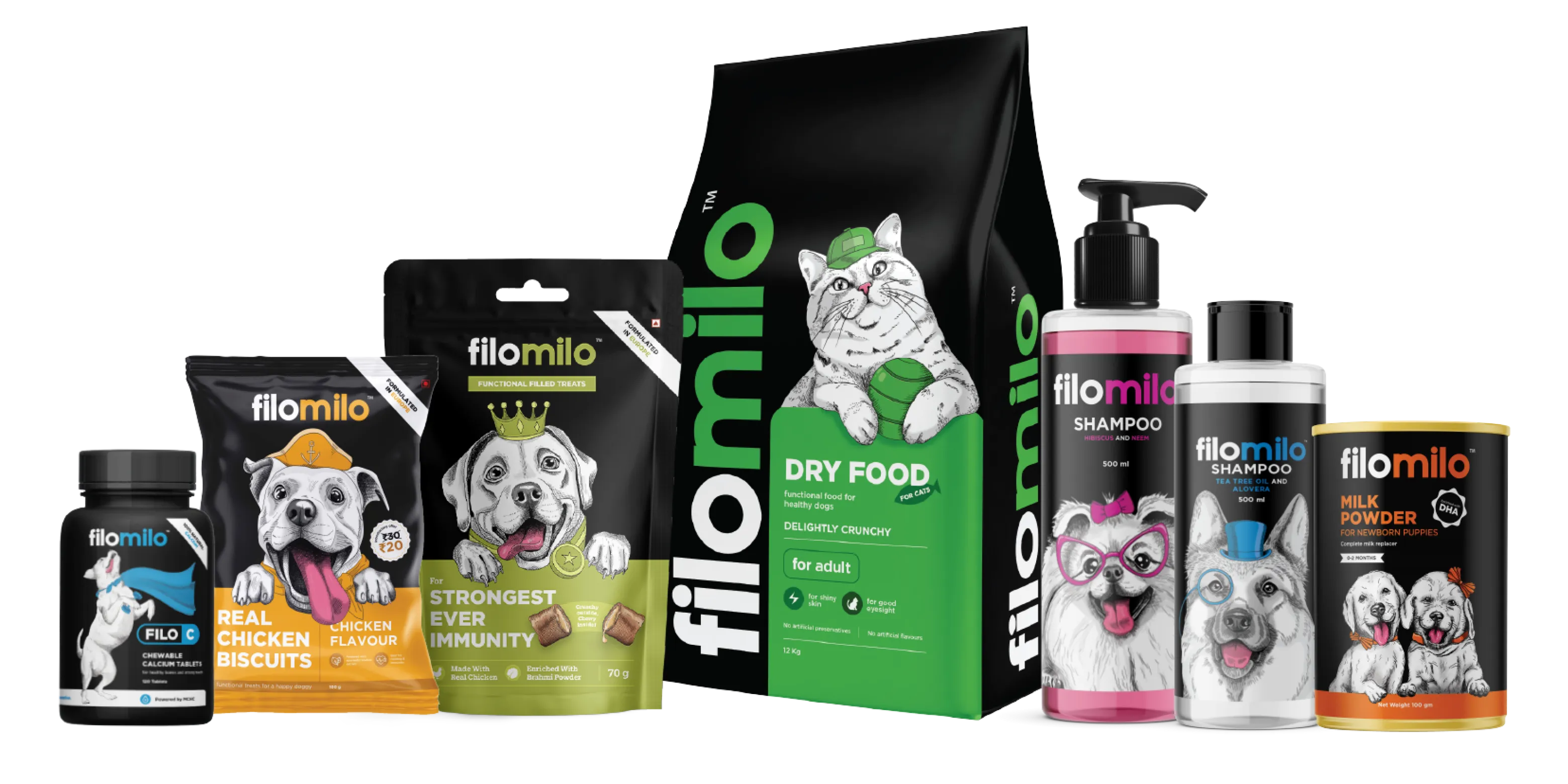
We took a quick look at the established pet food brands and saw a sea of mustard, red and white shades dominating the packaging. We went against the tide and chose bright, vibrant shades on a background of jet black. The black made the product look premium. The colours gave it a bold and young aesthetic, tailored to appeal to the younger generation of pet parents.

And an illustration style that stands out on shelves
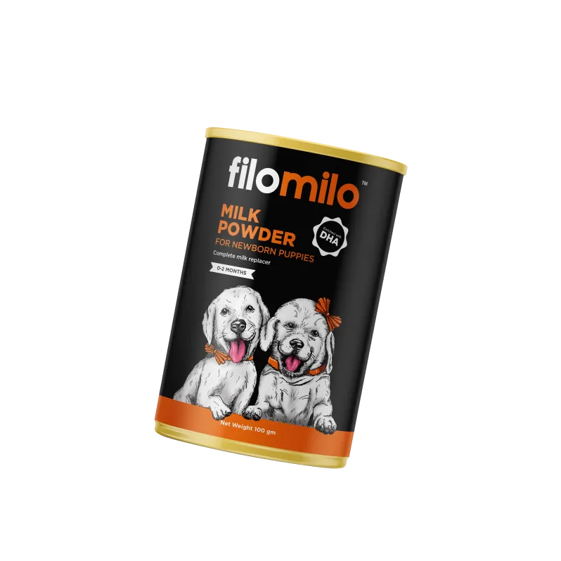
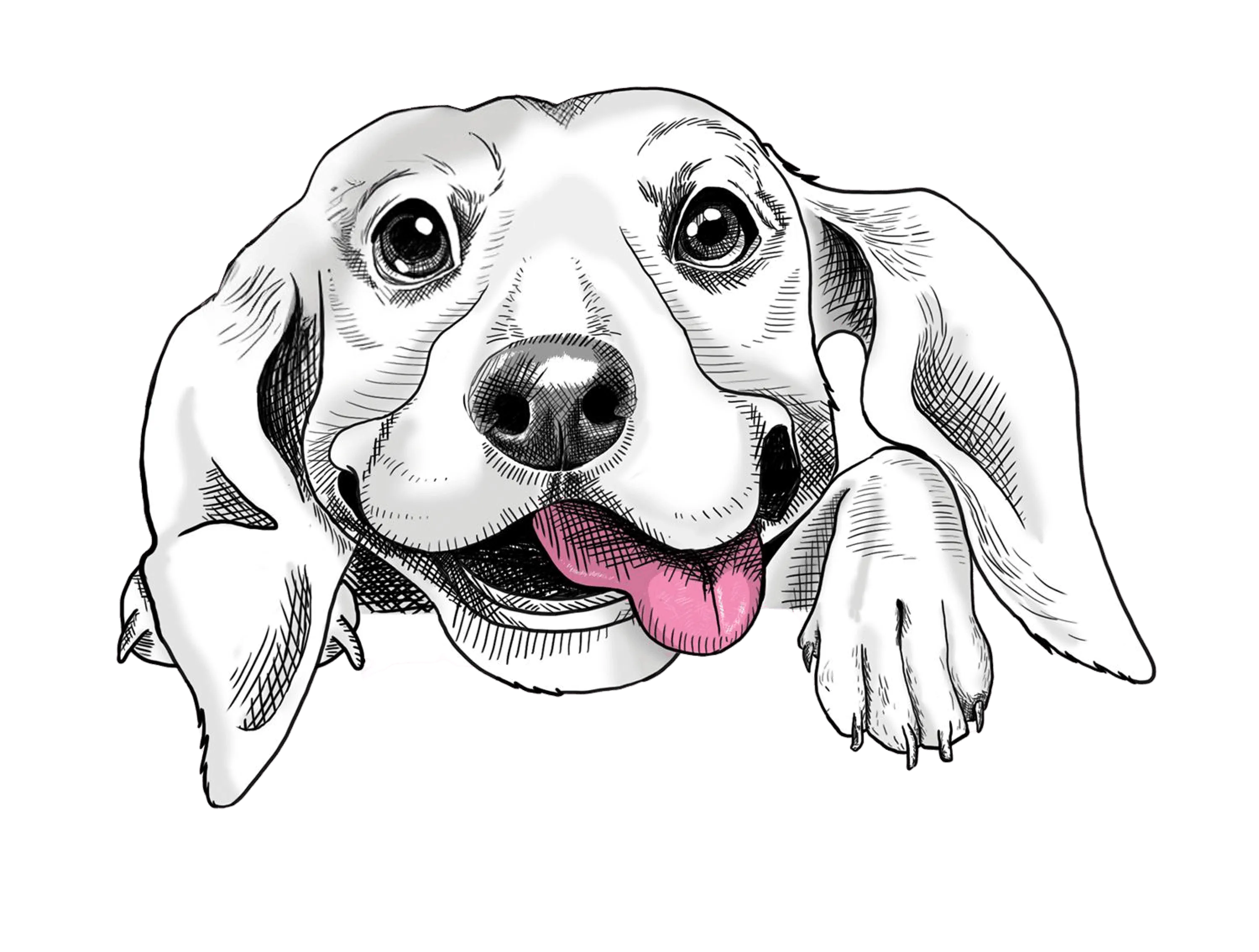
We chose to go the illustration route, picking popular breeds like retrievers, pugs and german shepherds and using them prominently on the packaging. These critters had personalities of their own; some of them wore headphones, some of them wore gentlemanly hats, all of them looked directly into the eyes of the viewer to connect with them instantly. The props they bore featured colours directly associated with the food flavours, such as yellow for chicken, red for mutton, and blue for milk and eggs.

%201.webp)
.webp)
%201.webp)
%201.webp)


And fun shapes for the packaging, that hint at the drool-worthy treats inside!
Why stop at having the food itself look like a bone? We imagined and created containers for the product that looked like bones themselves! Not only did it aim to help them stand out on the shelves, but also to add a fun element to the daily feeding ritual of every pet parent.
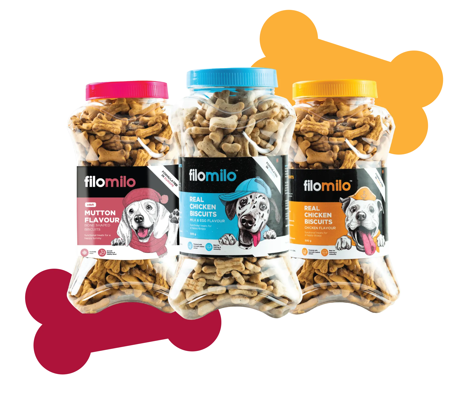
A whole new way to say “bone”- appetit!
Evolution of the brand
The cuteness we created went everywhere. From happy puppies on our stationery (who wouldn’t want to hand out one of those cards) to dapper dogs welcoming people into stores; all collateral was meant to make people delighted because that’s what pets do. Why should pet food be any different?


Just as pet parents have a lifestyle that’s different, so do their pets. Can you imagine a dog being an Instagram influencer 15 years ago? Let’s design for the times!
That’s the approach we took to designing our collaterals, and to building FiloMilo’s digital presence- packing it with personality, punch & charisma .
%202.webp)


A brand full of delight for pet parents, & temptation to get one for those who aren’t!
- A brand name that’s fun to say and easy to remember.
- A brand language that is all about the quirky and diverse ways in which animals endear themselves to humans, with the pets themselves being front and centre.
- Products that stand out on the shelves from the competition, with packaging that’s vibrant, playful and inviting to customers.


A heartfelt message from our designers
We are proud to have played a part in creating a design that helps pets live their best lives and brings joy to pet owners everywhere.
