Crafting a warm and down-to-earth identity & packaging for a brand that’s breathing new life into India’s disappearing art forms.
Client
Nirantharaa
Industry
Handicrafts
Duration
3 months
Year
2021
Scope of Work
Brand Identity
Packaging
Nirantharaa is a platform that merges traditional Indian artisanship and contemporary design to create unique and timeless products while differentiating itself from craft marketplaces.
Being down-to-earth. Indian culture & tradition. Evolution into modern design.
While exploring this identity, a parallel challenge was to create unique packaging with a dry banana fibre material that was beautiful yet non-conducive to regular methods of printing.
Artefacts within artefacts
Our vision was to have the Nirantharaa packaging seem like an artefact in and of itself. We wanted to think beyond the usual packaging materials like labels, box sleeves, and tags and used a modular grid & stamp system to do it.
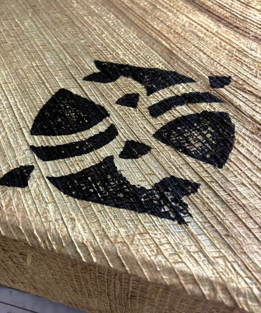
We iterated on illustration styles to see which style would work well when stamped onto a box like ours with its unusually rugged surface.
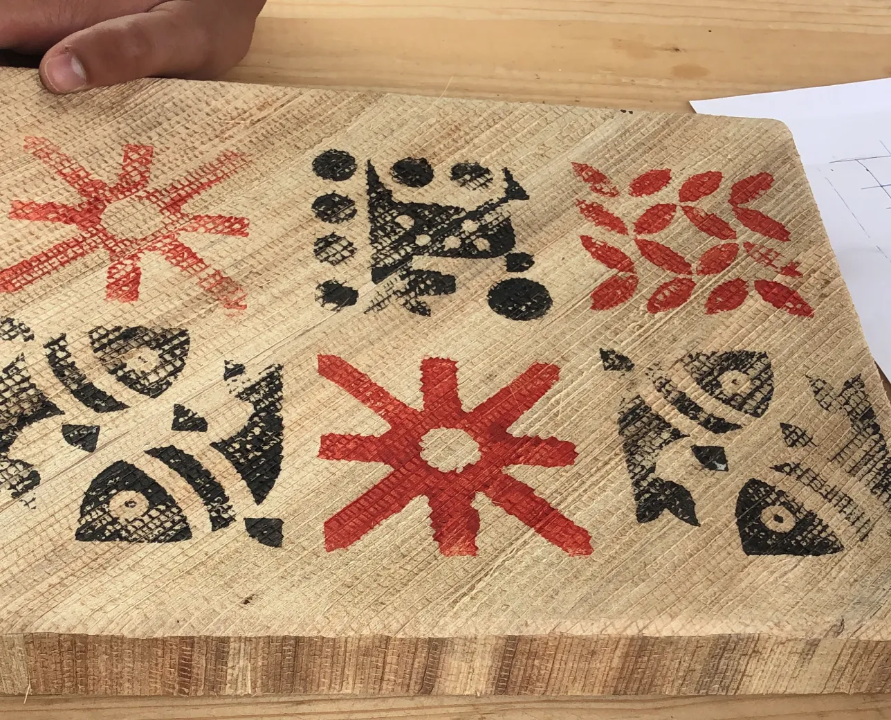
We designed custom motifs inspired by Indian flora and fauna, a common theme across Indian craft forms.
These motifs highlighted the focus on craft and brought out the unique relationship between modern design and traditional artisanship.
Many motifs,
one system
After exploring different ways to represent the motifs, we arrived at a modular square tile grid system. This let us arrange the icons on boxes in various combinations, in any any size and dimension.
The logo
The Nirantharaa logo has been crafted keeping in mind the brand’s core values and visions of bringing forth our heritage and culture through well designed and beautifully handcrafted artifacts.
The logo was dynamic, changing to match the ethos and craftsmanship that had gone into each specific product. Different versions of the logo were thus designed with varying motifs to use on different products.
The sun motif for lamps, diyas and lights.
The whirlpool motif for windchimes and other artefacts that could be suspended from the ground.
The water motif for coasters, glasses, bowls and other items where a liquid would come in contact with the product.
The floral motif for artisanal home decor pieces.
Colour palette
The colour palette we defined for Nirantharaa was warm and down-to-earth with reds, yellows, and pale whites, which brought out the centuries-old artisanship that was the bedrock of the brand.
The secondary palette is used in additon to the core brand palette across digital touchpoints like social media posts, illustrations for print and product catalogues
Light Beige
#F9E9D2
Orange
#DF8F30
Deep Green
#22664C
Light Beige
#201D1E
Beige
#F4D099
Light Green
#A6CB6C
Deep Red
#902525
Right Grotesk with its unusual anatomy and exaggerated inktraps offers a characteristic bold appearance, making it a good choice as the primary font.
Since the brand stood for handcrafting of products, we saw these motifs and the grid as a way to personalise and "hand-craft" even the branding on the box.
Since the brand stood for handcrafting of products, we saw these motifs and the grid as a way to personalise and "hand-craft"even the branding on the box.
Manifesting the packaging
Finding the right ink and materials for the stamp was a challenge.
The box was made of a unique banana fibre with many undulations which added to the beauty and uniqueness of the box, but made it difficult to print on.
We incorporated four motifs depicting the elements of nature in the logo.
Sun for fire
Whirlpool for air
Waveform for water
Floral for earth
Packaging perplexities and extreme experimentation
We tried multiple options for printing and stamping on this unusual banana fibre box. We brainstormed, got hands-on and tried stamps made of foam, wood and rubber to check the intensity of their impressions.
The designs we wanted to stamp were intricate, with delicate shapes and details that machines could not render just right. The casts for stamping them were hence carefully selected and carved by hand into top quality wood. This method was able to highlight the subtleties that are so typical to traditional Indian art forms.
While we already had a firm grasp of print methods and materials expertise, our knowledge leveled up many-fold after this project, with the sheer amount of trial and error that we ended up doing. We can’t wait to see how can we use these learnings for future projects.


.webp)