Building a brand that helps students make the most of the world’s opportunities
.webp)
.webp)
.webp)
.webp)
Global Study Tech was a comprehensive portal that helped students study abroad, right from choosing a university to navigating housing solutions in the new country.
The Project
This project required us to give the brand a new identity, from a new name and visual system to a redesigned website, and even the creation of an interactive app for student-advisor interaction.

The ambit of what Global Study offered was so vast that we first needed to define a brand architecture that could set the necessary guardrails for its many products and services.

A sprawling brand architecture
The brand architecture was vast, with different sub-brands of varying names that were popular in different countries - this had to be taken into consideration while renaming.

Keeping it simple
The visual identity needed to be exceedingly simple to cover all touchpoints and reflect a modern outlook, deviating significantly from the existing site design.

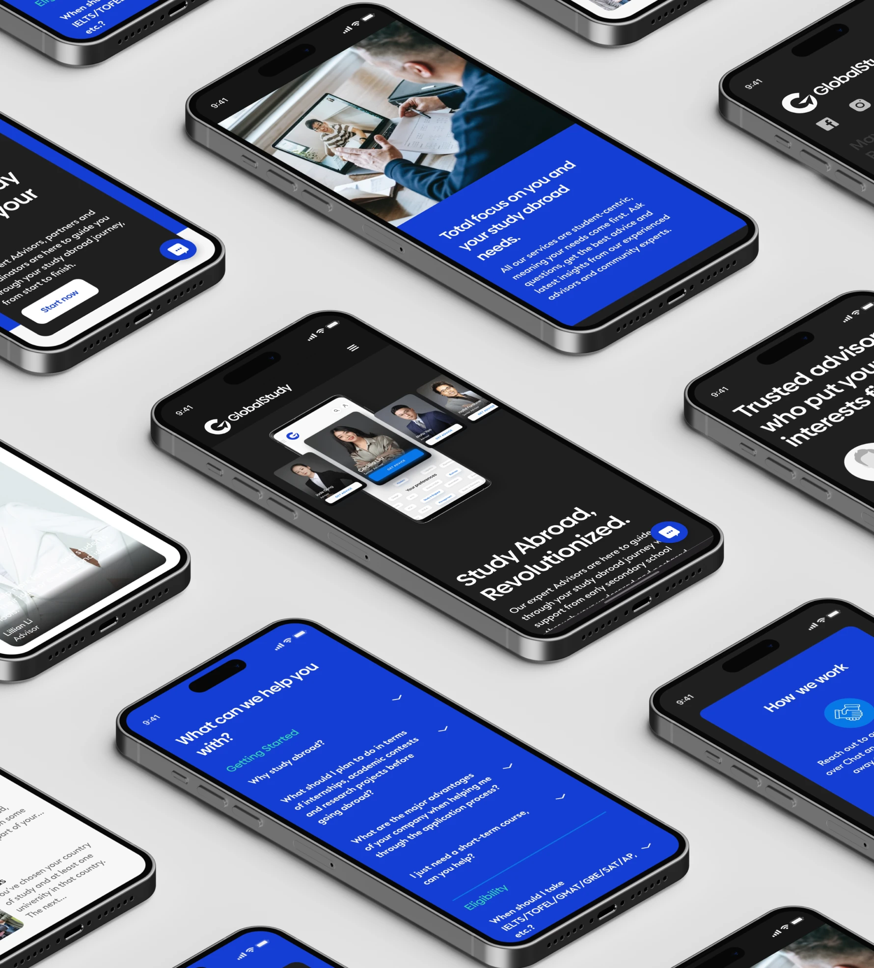
An interactive app
The interactive app needed to be built to cater to students and advisors from across the world.


The portal launched in 2020 as Global Study Technology.
They acquired companies along the way, which led to the requirement for a unified brand architecture.
The portal launched in 2020 as Global Study Technology.
They acquired companies along the way, which led to the requirement for a unified brand architecture.


.webp)


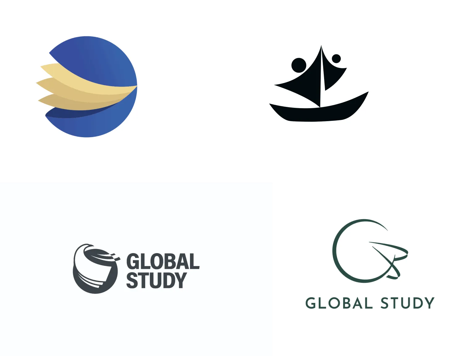
A name so simple.
We simplified and named the main brand “Global Study” to make it more user-facing while retaining the original name’s familiarity.Wherever a sub-brand was very popular in a particular country, we either kept its name or redirected it to the main brand.

A logo that spoke volumes.
Keeping in mind the multiple uses of the logo across web channels and portals, we wanted to create one that was easily identifiable and worked in all sizes.
We arrived at the paper plane motif as the brand’s key identifier.
It depicted the journey of going overseas to study and reflected the users’ aspirations. It also served as a visual aid to bind together the multiple diverse services the brand provided in the studying-abroad process.


A whole new UX
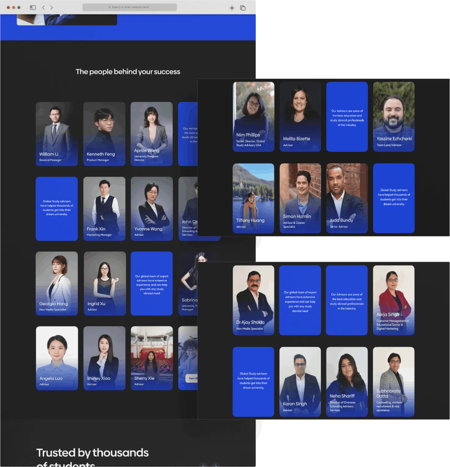
We took the visual identity ahead in the website, depicting the multitude of services through deceptively simple UX, a professional dark design, and crisp information.
Elements were added to solidify the user's belief in the brand before they even thought to look for specific solutions.


Examples of these were the testimonials of previous students and the philosophy of the different advisors on the homepage itself, which built social proof for the brand and personal connections respectively.


The Outcome

A simple name and design with a global appeal, just right for students across the world who are looking to take the next big step in their education and career.
GS Blue
GS White
GS White


An intuitive website that conveys a lot of information in an effective and easy-to-browse manner, showing the extensive range of services the brand provides.
Features on the website that focus on personal requirements and connections, be it through messages from advisors or the ability to search through the FAQs.


The Inside Look
By the end of this project, 2 of our team members were very wistful because they wished they had this kind of service when they were going to study abroad!

.webp)