Highlighting the growth-focused nature of this innovation firm through sleek design decisions

a steama graphic
Client
Steam-a
Industry
Tech
Duration
6 months
Year
2021
Scope of Work
Brand Identity
Digital Design
VISIT LIVE WEBSITE
THE CHALLENGE

Is it a consultancy?

Is it tech?

Is it design?

Steam-A works with a vast clientele to drive sustainability through advisory, tech, strategy and more - working on products and solutions for multiple fields, from EVs to supply chain and logistics. The one common factor is the laser focus on design, both functional and aesthetic. The challenge then stemmed from how we could create a visual language that summed up everything Steam-A offered while making this otherwise technical organization artistic and beautiful.

Steama Mug
OUR APPROACH

Cover it all

We started with what Steam-A stood for. Steam is an acronym for science, technology, engineering, arts and management. A stood for its A-team that delivered value through all its services. We understood that not only would the scope of this identity be vast, but it needed to be scalable to cover every aspect of Steam-A’s current and future business, while remaining fresh and unique.

steama a

Steam-A’s area of expertise is varied and extensive. Keeping this in mind, the logo has been crafted to allow for just enough customisation and variety to suit the needs of current and future brand ventures and their respective touchpoints. The Steam-A logo can make use of a wide range of gradient fills.

steama white
steama green gradient
steama red
steama blue gradient
steam a explainer
A = Art
A = Ambition
A = Added Value
A = Aspiration

Looking up

We gave a new approach to the A in Steam-A, and made it our core concept from a communication and design point of view.

Steam-A told us time and time again how invaluable their team was and how their A-team pushed them to greater heights every day. Highlighting that “A” then seemed to be the perfect way to showcase their offerings. By making the “A” an exponent in the brand name, we derived a standout treatment for the identity and used it for all communication that needed to be highlighted. The font treatment given to the exponent also serves to show how the results were always standing out, deserving to be highlighted for the team’s effort that went into it.

The exponent was more than just a design treatment. Through it we wanted to highlight the aspect of growth and evolution, and how rapidly Steam-A was making strides in their various fields and showing visible and speedy results with their work. Everything proceeds exponentially, raised to the power of  what it needs. That’s how Steam-A rolls.

card scattered

Design for artistry

Steam-A was not just a tech or management organization, it stood for creativity and inspiration. So we decided not to limit the brand with a specific colour palette, and instead use the full colour spectrum to show the diversity of skill sets and capabilities that it possessed through a variety of gradients and textures.

green gradient
steama a line
blue red gradient
fire graident
red black gradient
voilet re gradient

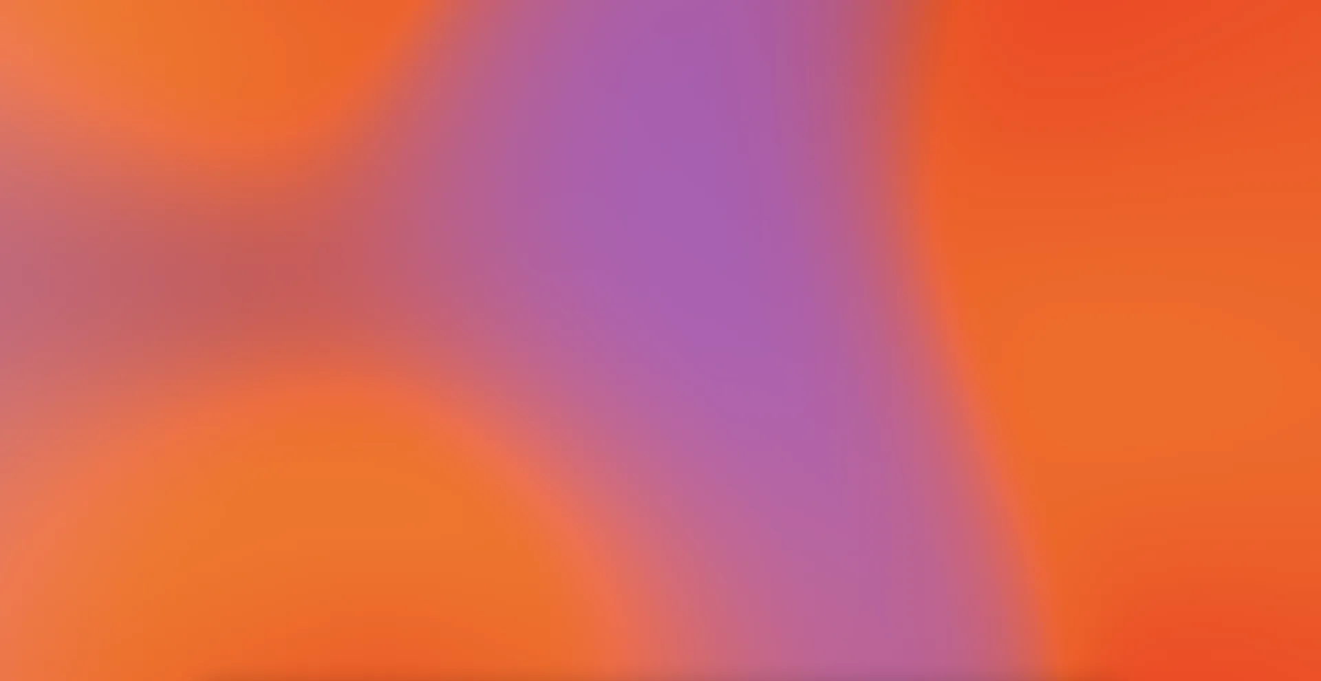
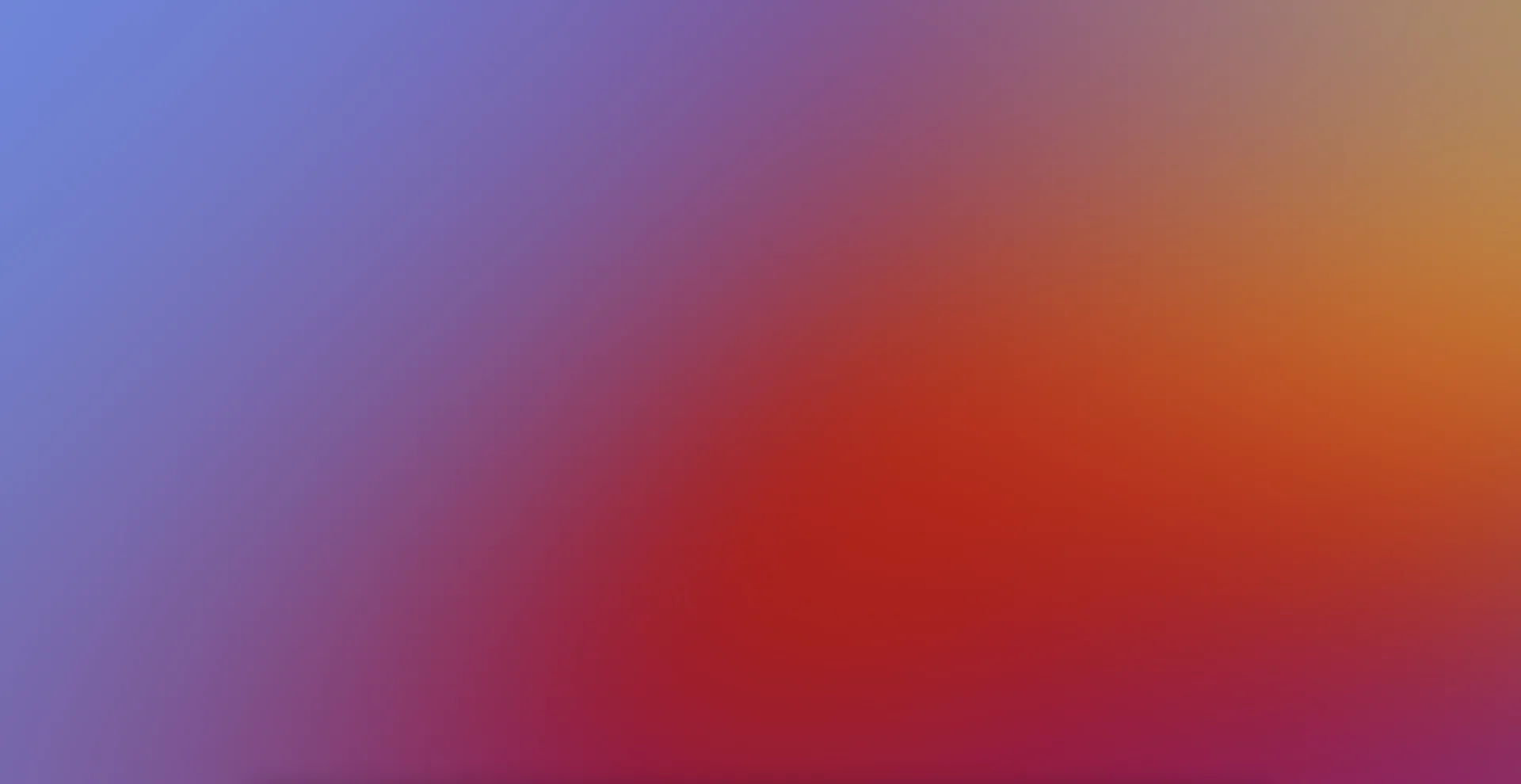
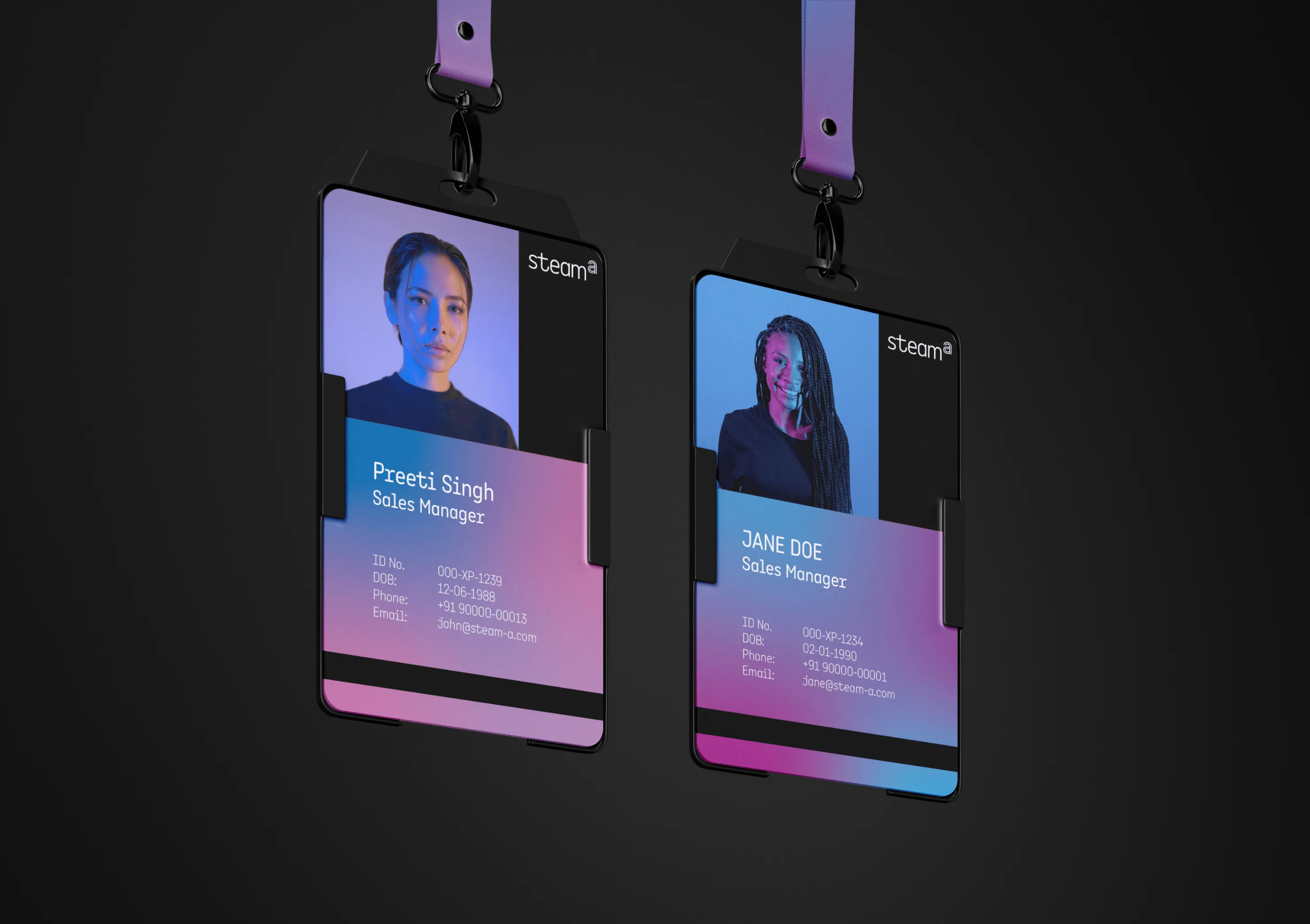
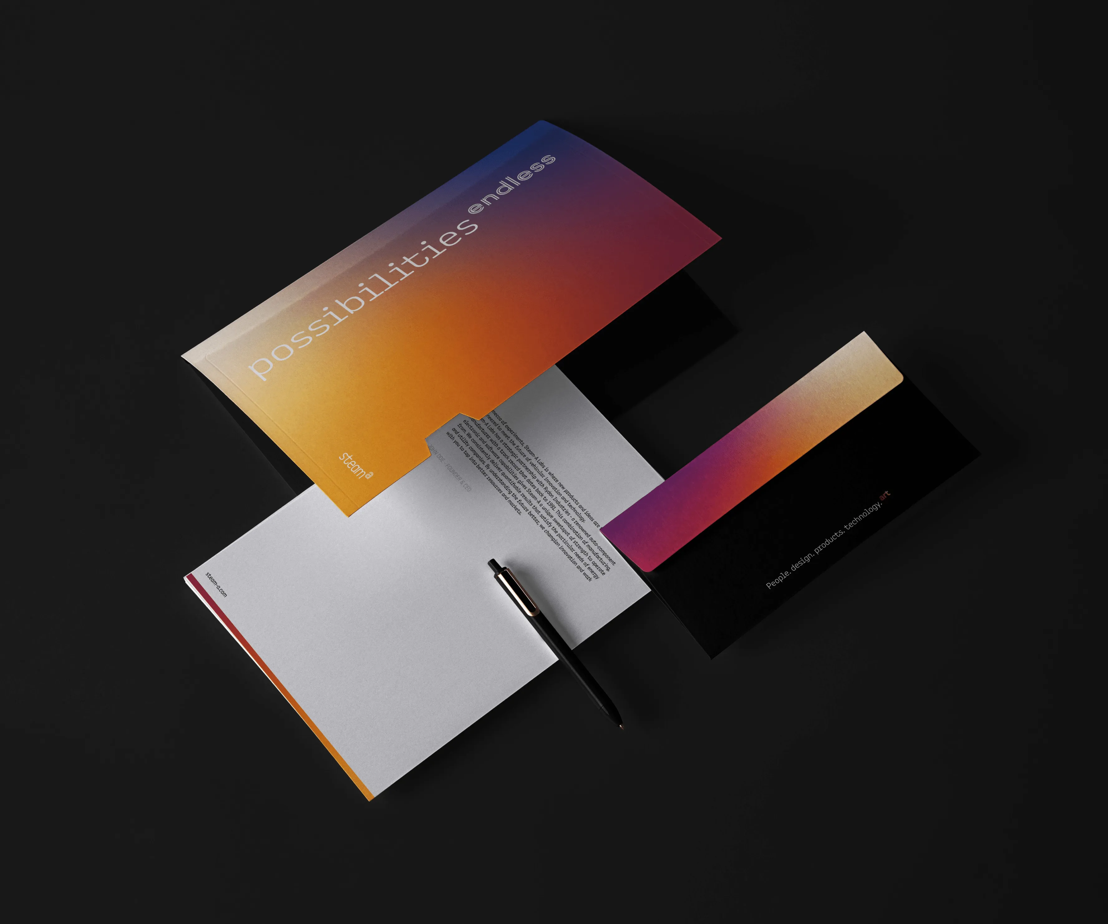
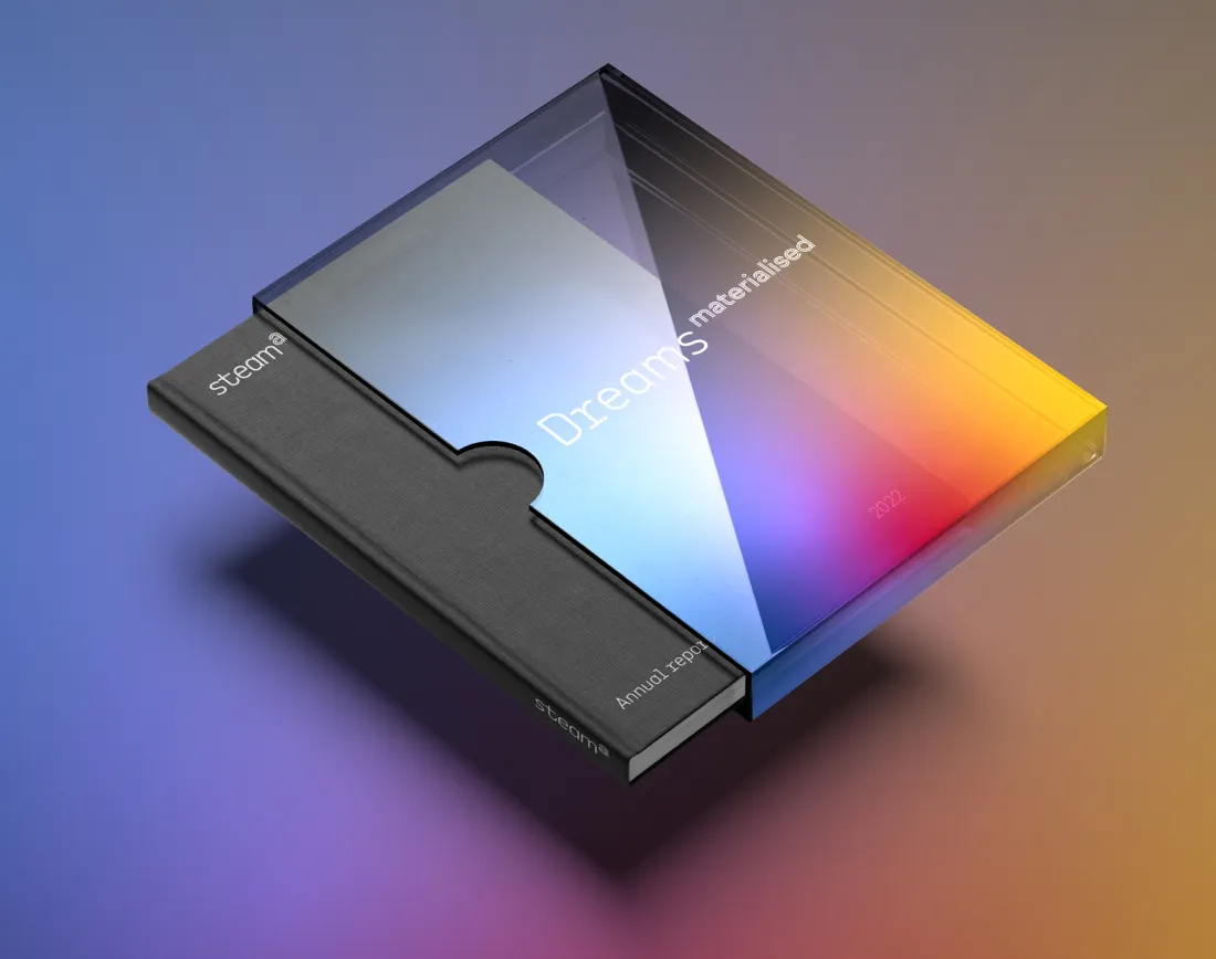
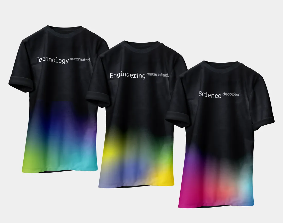
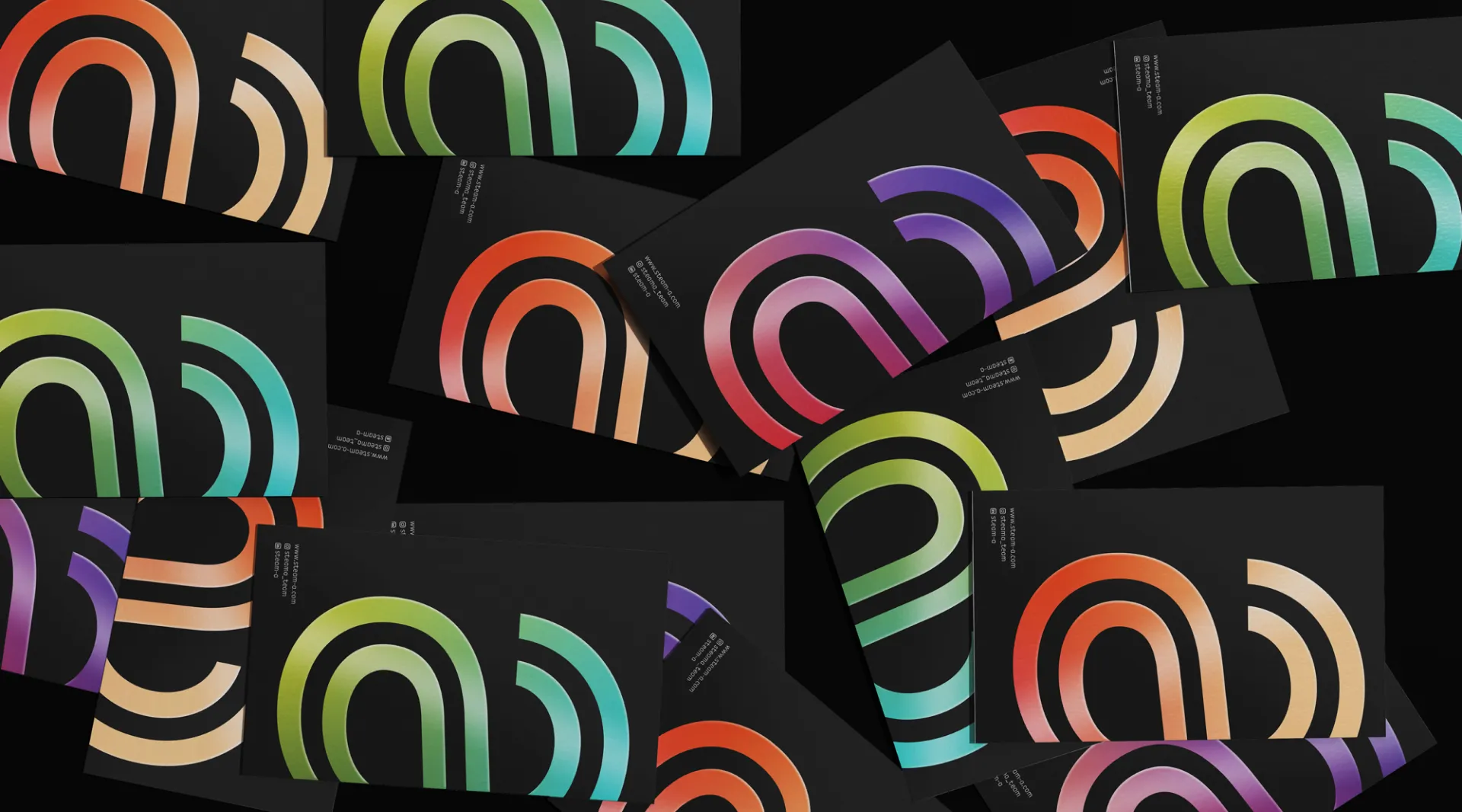
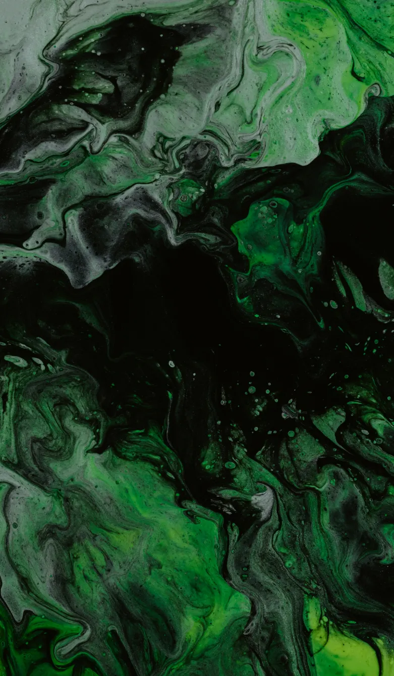
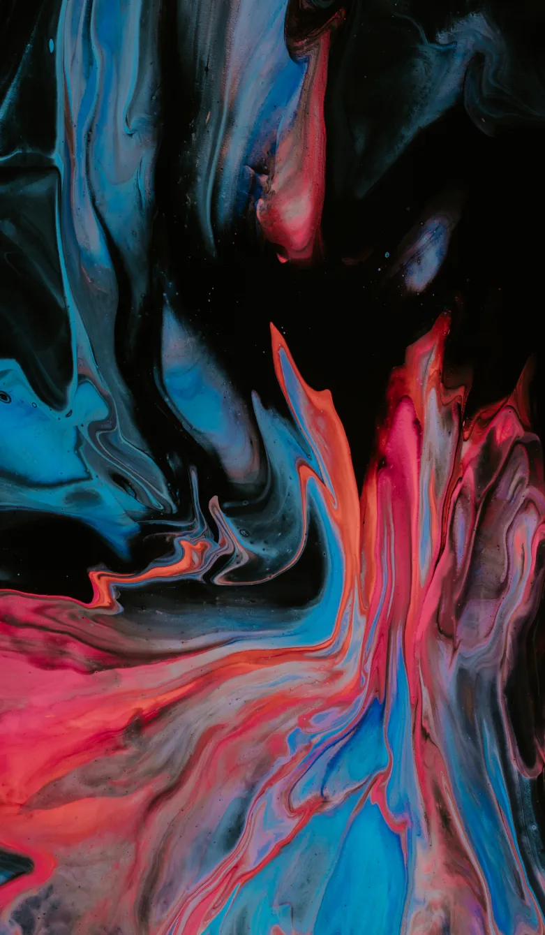
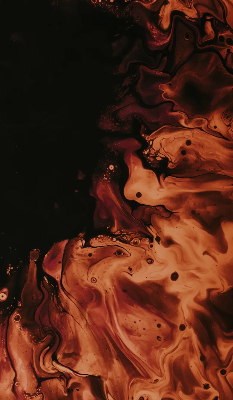
In our explorations we discovered that creating beautiful gradients can be quite a task.

This led us to create a gradient tool that let us capture gradients easily based on several defined colour palettes. This ensures consistency in colours but an assured unique gradient with every use so there is identity without repetition.

Beauty & function coexist

Our design system brought out Steam-A’s focus on both. The base colour palette was neutral, with blacks and whites forming the foundation of all design.

bg gradient 
orange gradient
red gradient
Light red & red gradient
violet and red gradient
mix gradient
steama card
steama id cardsteama stationery

Overlaid on that was warm typography, gradients and paint textures, a set of icons and illustrations created for the brand to go with its exponent font, and a flexible grid-based layout.

happy people outline
investing in customer success
outcome focused
team outline
startup factory outline
steam a labs outline

The end result was striking yet understated, cohesive yet experimental. Just like Steam-A itself.

steama illustration
this is us form
what does tomorrow look
form function & experience
THE OUTCOME

A beautiful unique design that perfectly captured the brand’s vision and made it stand out in the landscape of competitors.

steama black bg imac

The A in Steam-A stands for the A-team that does stellar work. This new brand identity (which extended to the website) serves to attract more grade-A talent who will build up the organisation further!

THE INSIDE LOOK

We explored many different concepts but rejected them all for looking too conventional as per the usual definitions of technology.

Corporate Memphis wouldn’t do for this project!

steama 2 mobile steama explorationsteama macbook
OUR TAKEAWAYS

Tech needn’t look like “tech”. Why follow the tropes when we can colour outside the lines?

steama dreams booksteama shirt
steama shirt with pocket

There’s still a lot to learn.

We dabbled with some unfamiliar tech to build the website, used a 3D library for creating gradients, and discovered new ways of doing things that we’re sure to use in future projects.

A few side effects of working as we did…

01

When we were internally discussing the project over email, we started using exponents to highlight some points!

02

We can’t wait to use some of the skills we learned. Hurrah to our own A-team!