How can true biophilic living translate into design? We got to the root of it and found out.
Publication Design
Digital Design
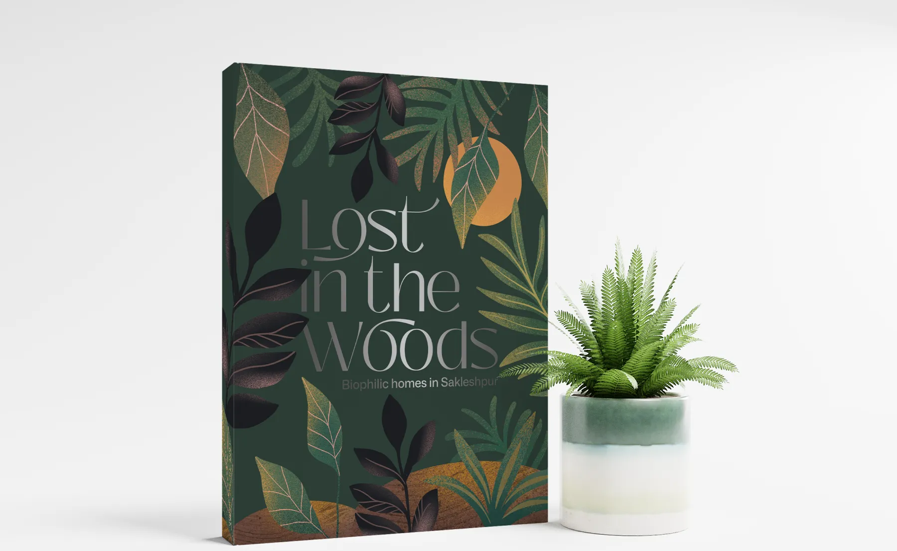
Creating an identity for Lost In The Woods, a one-of-a-kind sustainable biophilic property in Sakleshpur that focuses on reciprocity with nature.
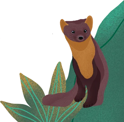
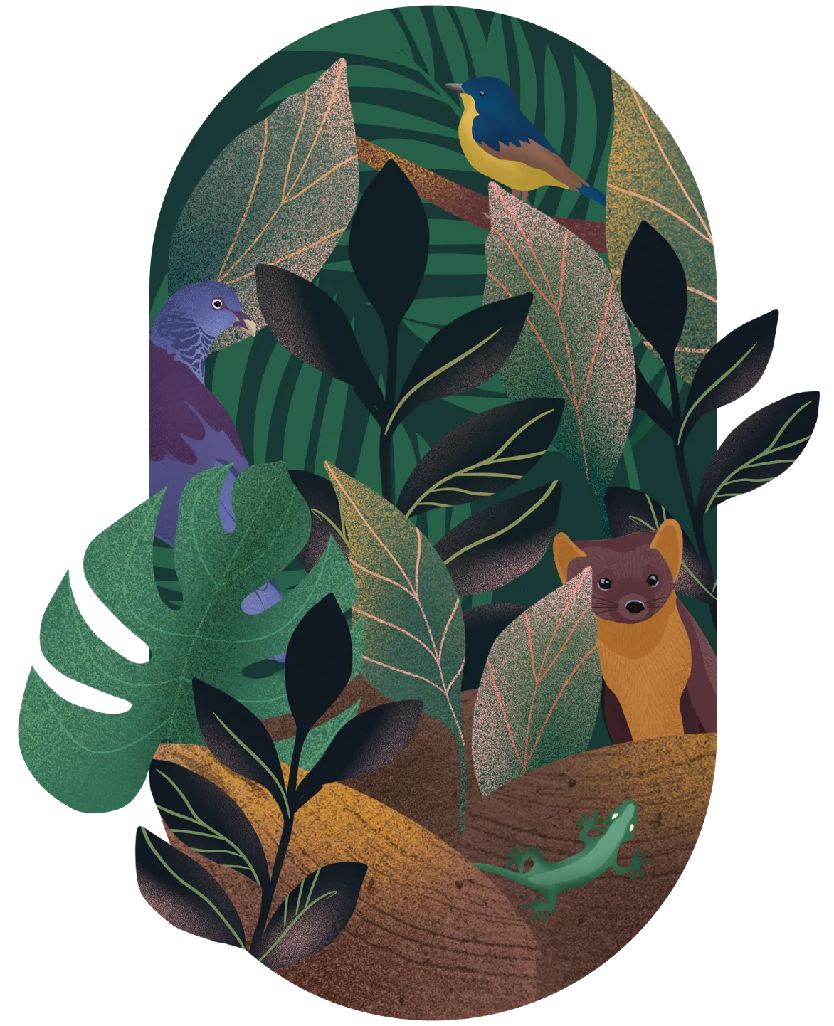
Lost in the Woods was focused on holistic biophilic living, from going paint-free to strictly maintaining the local ecosystem.
Our approach was to keep this symbiosis with nature sacrosanct.
We mirrored the project’s grand vision
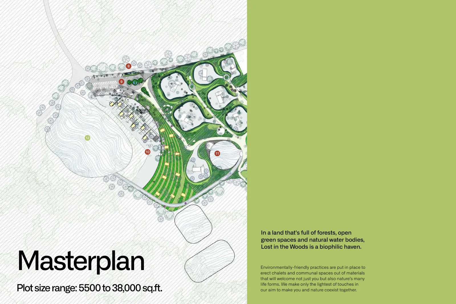
We used the raw material from the architect as a direct reference for design and crafted an aesthetic and voice that highlighted the closeness to nature.

We made basic beautiful
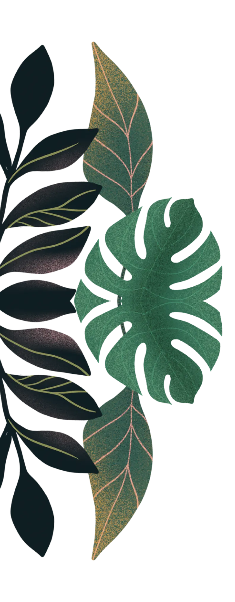
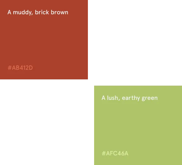
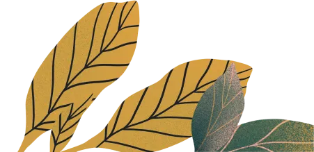
Our design had an abundance of whitespace on which minimalistic elements shone through in bright greens, earthy reds & gritty grays that evoked the project’s eponymous woods.
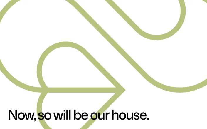
Cut to the heart
Our language was personal, speaking to those who valued nature over luxury and the environment over comfort, showing them that they didn’t have to choose one over the other.


A few lines spoke a thousand words
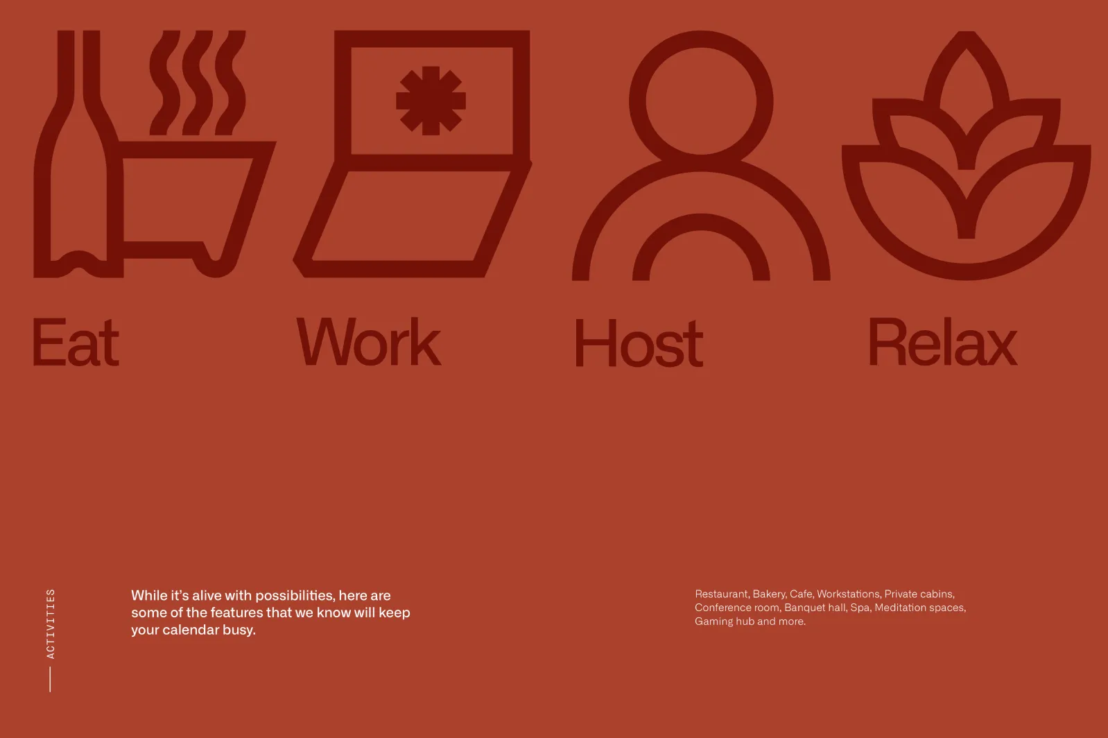
Our icon set drew inspiration from hieroglyphics and was used throughout the brochure to highlight features without too much text.
Time to hit the road


THE OUTCOME
An elegant brochure that people read almost cover to cover.


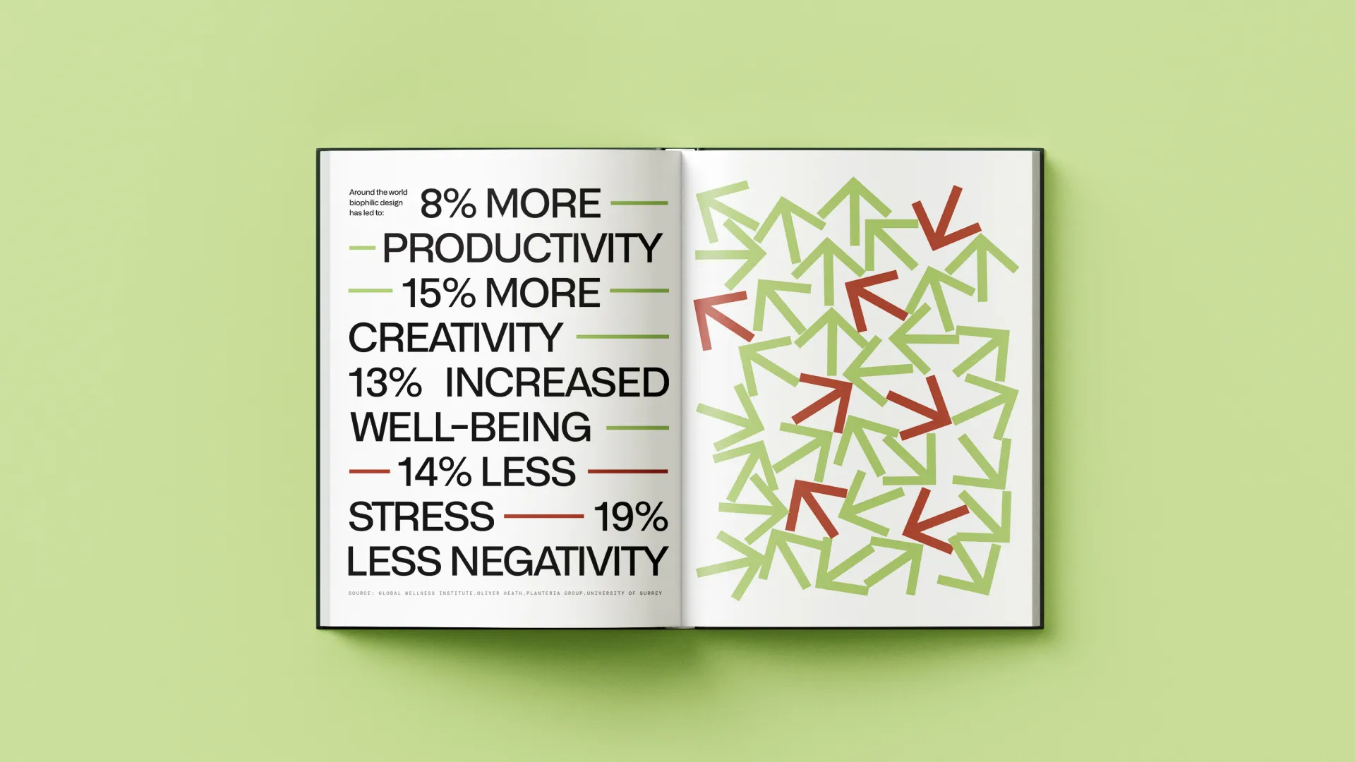
We learnt how to typeset better and in such a way that the sentences are legible by readers despite their unconventional placement. This was especially a challenge when we were working with a few statistics pages where we had to use a mix of icons, patterns and text.


One icon is worth a dozen words. We created simple, geometric and instantly recognisable icons that drew inspiration from hieroglyphics. These were liberally used throughout the brochure to highlight the different features without too much text.

Most importantly, readers wanted to see and experience Lost in the Woods for themselves.
At the end of this project, we came away with a newfound appreciation for nature and how it can give you all the answers if you look hard enough. All we hope is for others to discover everything they want and need within the green.