We also designed a simple line illustration icon set to illustrate product benefits & directions for use.
Clinical and classy packaging for a skincare brand that's proudly no-B.S.
Client
Deconstruct
Industry
Health and Beauty
Duration
6 months
Year
2021
Scope of Work
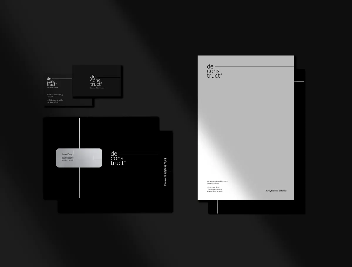
Brand Identity
Packaging
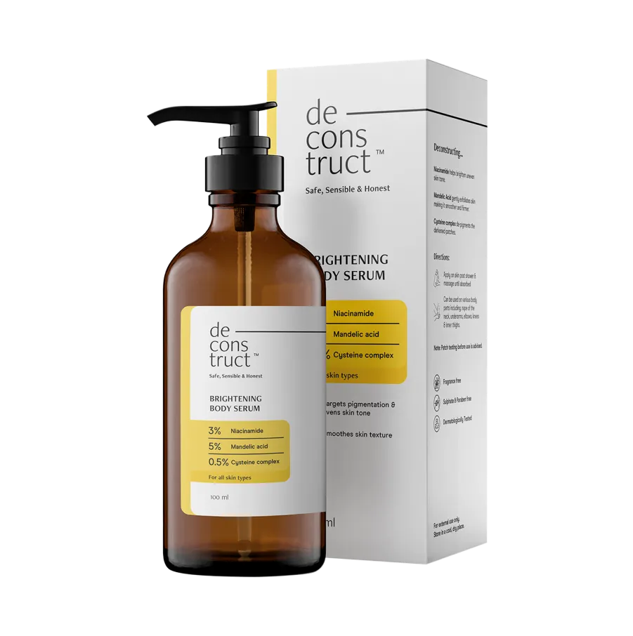
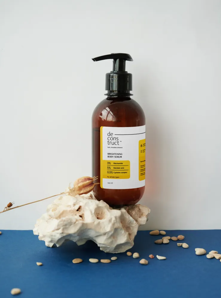
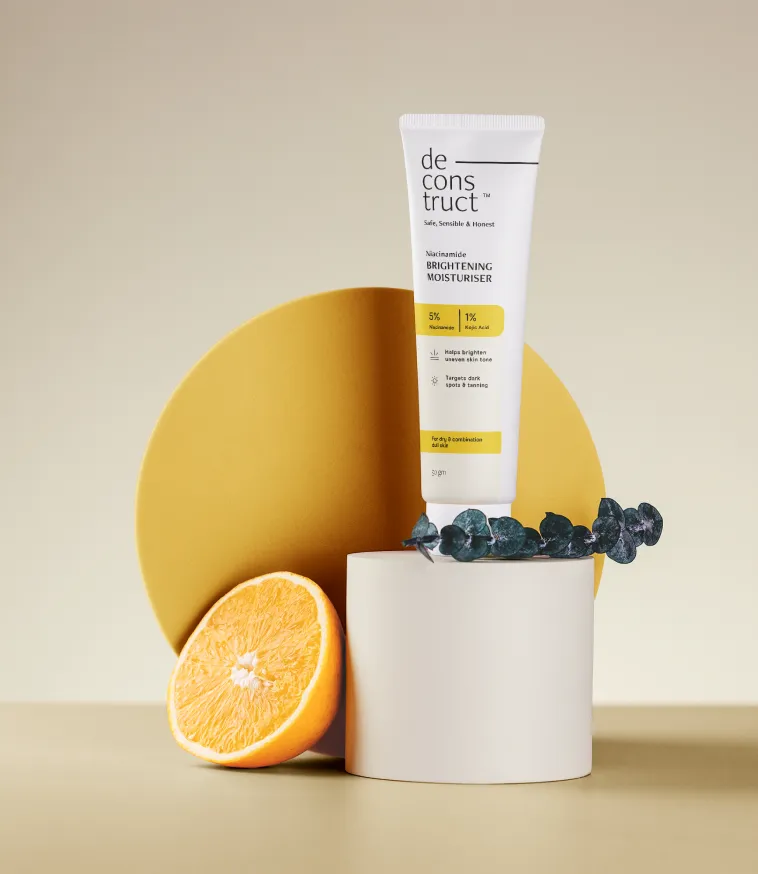
Creating the packaging design for Deconstruct, a skincare brand that cuts out the clutter of fillers and unnecessary ingredients, and focuses on relevant effective actives.
.webp)
THE CHALLENGE

Let's disrupt & deconstruct skincare.
Out with unrealistic aspirations. In with an evidence-based, scientific approach that's reflected through design.
OUR APPROACH
Declutter everything

We drew inspiration from the product formulations and stripped away the unnecessary to keep the packaging and visual system very minimal in terms of colours, text, and visual elements.

Deconstruct the design itself
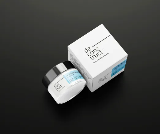
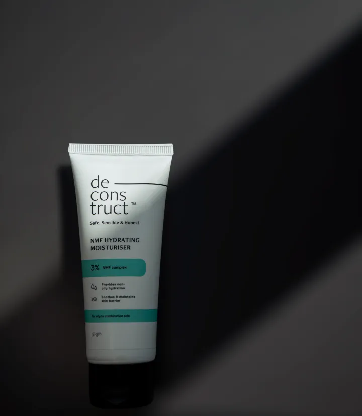
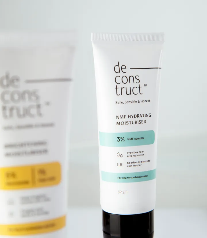
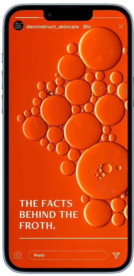
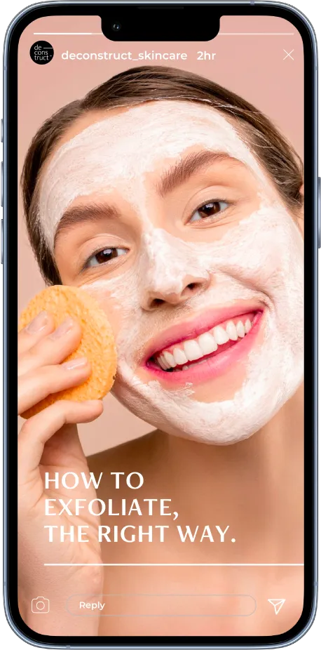
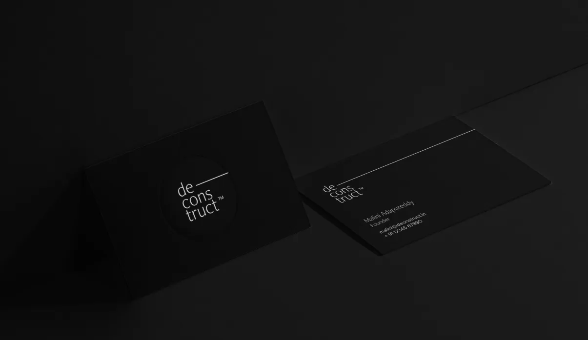
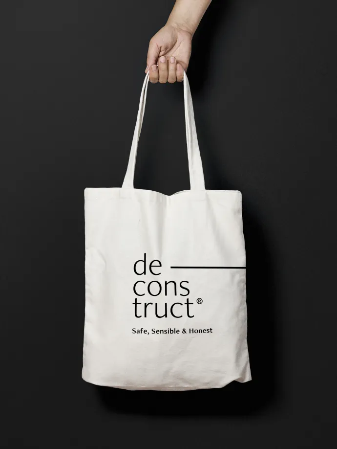
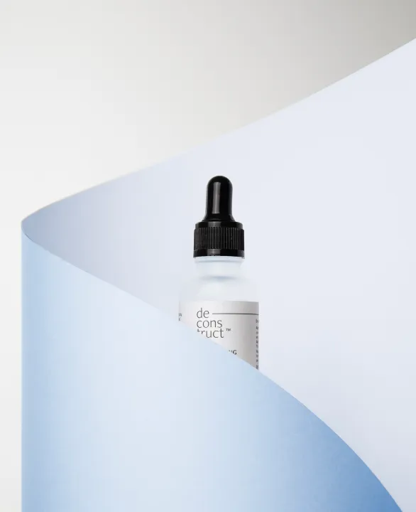
The brand believed in breaking things down to basics so we reflected that belief in its logomark itself. The word “Deconstruct”, deconstructed and split across three lines.

Minimal all the way
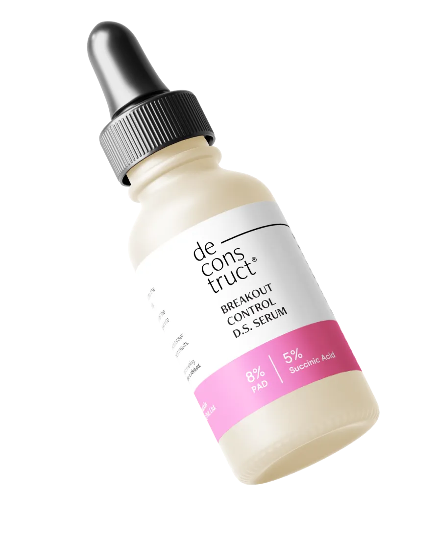
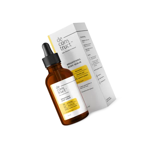
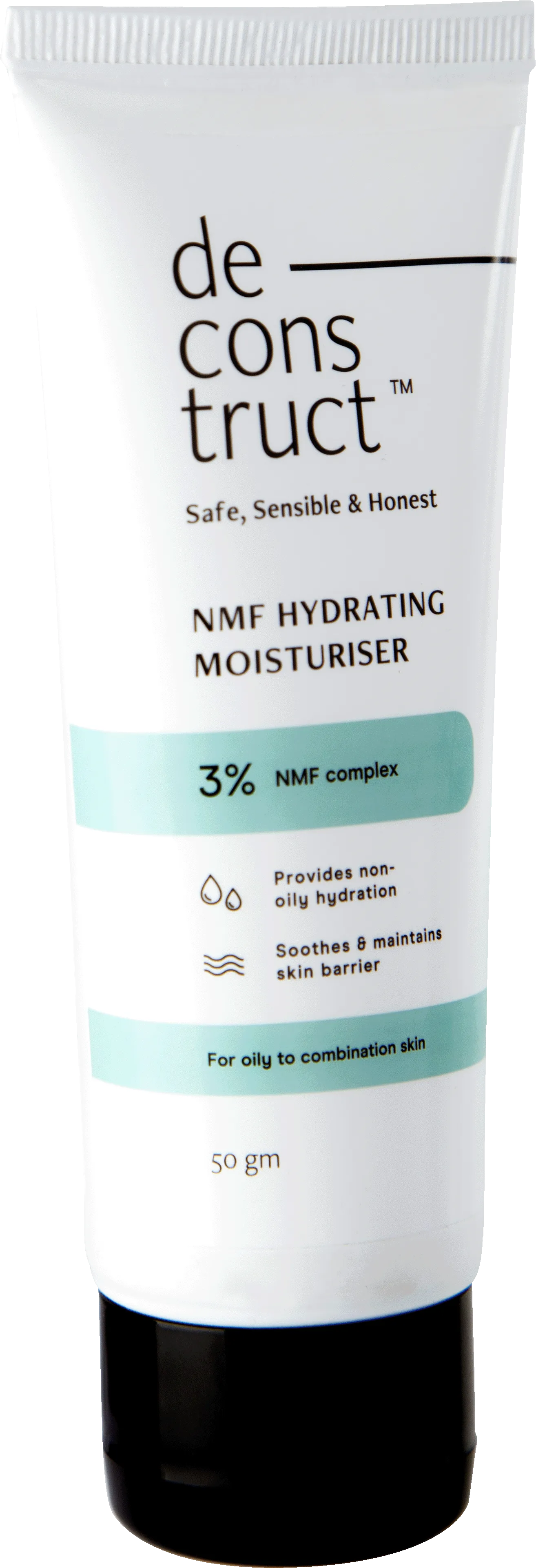
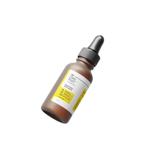
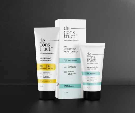
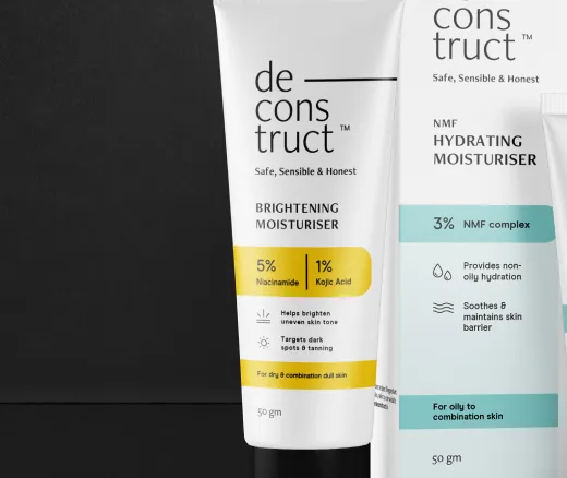
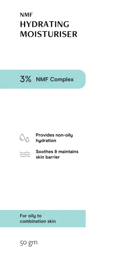
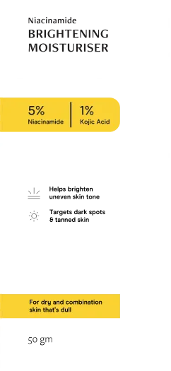
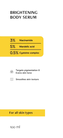
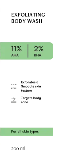
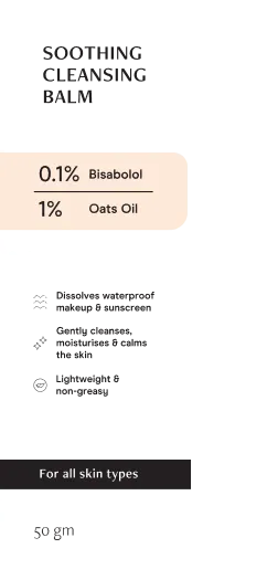
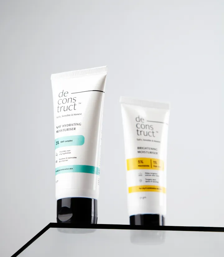
No extra elements, no huge blocks of text. The graphical elements we used were restricted to rectangles with rounded corners, with variants of these containers differentiating between products.
Show, don’t tell
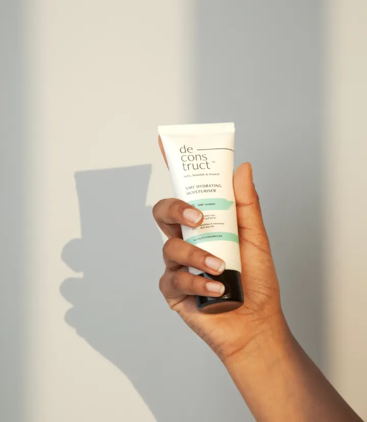
We relied on strategic placement of negative space to make the packaging design look clean and clutter-free, to draw more attention to the text. The text itself followed a strict information hierarchy across various pack sizes with information divided into clusters.

THE OUTCOME
Minimal, simple packaging that reflected the brand’s no-filler, no-nonsense ethos, and their scientifically-proven product formulations.
01
A system of representing information to appeal to the informed customer who wants to know more about what each specific ingredient can do.
02
The inside look
01
We understood that not only would the scope of this identity be vast, but it needed to be scalable to cover every aspect of the brand's current and future business, while remaining fresh and unique.
02
Our design throws a spotlight on the text, but is complemented by simple linework - from the signature “dash” that’s a key part of the logomark to the illustrations for benefits and directions.
03
The visual elements, fonts and (slightly desaturated) colours were chosen to keep the design simple and clinical, yet distinct — both from other products on the shelves and from various products within Deconstruct’s range.
04
A key challenge was to use one single rectangular container in dozens of ways. By experimenting with colour, placement, and size, we identified a system to layer, reposition and scale it in multiple ways to be effective and scalable for any future products.

05
Our final brand book was massive, with a strict packaging system and information architecture for every kind of product from serum to sunscreen. Such few elements and so many ways to use them? You bet.
A palette that works for all things possible


TAKEAWAY #1
Minimalism can look beautiful and full of character.
You just have to create those few elements that are versatile enough to do the job!

TAKEAWAY #2
Clinical but cosmetic? We made it happen by paying attention to the details.
The right fonts that gave the product its character without compromising on legibility. The right tonality for every colour chosen. It was a job for the fastidious perfectionist. That’s us!
Iconset


Step 1

Use a small amount, massage it on to your skin for 30-60 seconds.
Step 2

Wash it off with water and pat dry.
Step 3

Use with Deconstruct Hydrating Serum for best results.
