Giving an established educational brand a global, modern, and scalable refresh.
Digital Design

A fusion of expertise and approachability
We envisioned NEC as a wise and friendly brand, guiding people along their educational journey by assuming the role of an approachable mentor. The communication and design approach hence repositioned the brand as one that understands the journey, and can take users by the hand along a path created for them.


The logo goes a long way towards merging these two facets of the brand’s personality. It depicts a human figure immersed in reading, nestled within the form of a tree which symbolises wisdom. Taking both elements from the previous logo, we redesigned them into a seamless icon with curves that employ classic proportions.

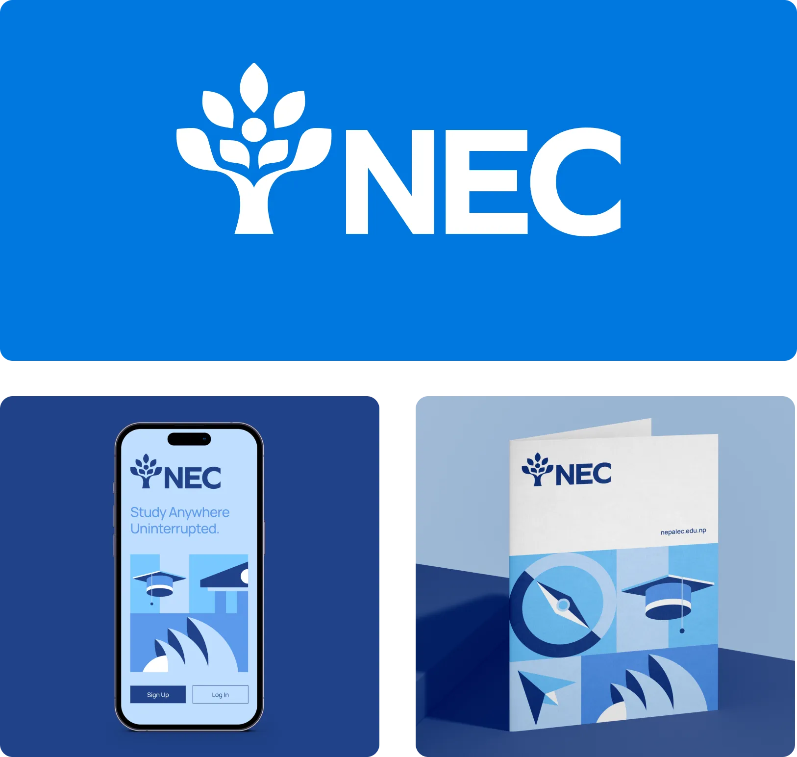
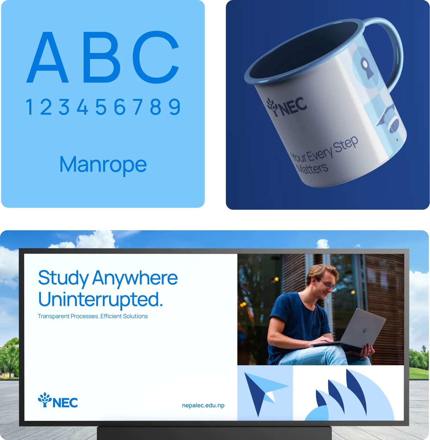

The chosen typeface is minimal and modern, made to convey clarity above all else.


The colour palette created consists of blue, yellow, and teal. These are meant to subtly symbolise the wide ocean of opportunities that exist for any student, and how NEC will be their guide to navigating it. This palette also evokes trust, optimism, and growth.

Infinite student journeys depicted through a modular icon set


Scalable design for limitless educational journeys


Bright imagery, our vast iconset and simple type come together to create a scalable design system that resonates with the target audience of ambitious students and their parents who have their sights set on a global education.

Giving direction to ambitions
Clean layouts and intuitive navigation ensure students can easily find the information they need, whether it's exploring program options or initiating the application process.


Our new identity brought NEC’s established brand into the present, and prepared it for the future. Not unlike how they themselves prepare students for exactly that.


