Contours that run through a development project, its logo form, and everything that comes after.
Client
Merusri
Developers
Developers
Industry
Real Estate
Duration
9 months
Year
2024
Scope of Work
Brand Identity
Digital Design
Publication Design
Environmental Graphics
Digital Design
Publication Design
Environmental Graphics
.webp)
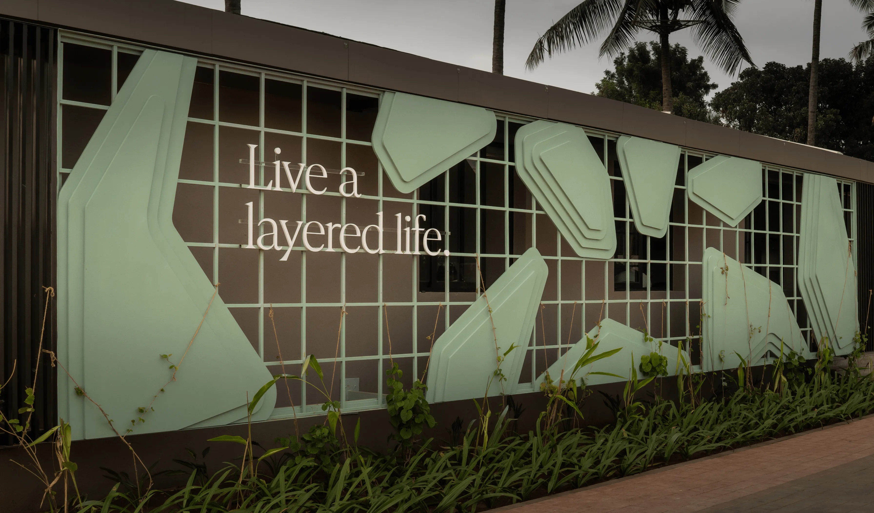
The project’s design is inspired by the Antelope Canyon of Arizona, a majestic red sandstone slot canyon formed millions of years ago. Antelopes cleverly incorporates mounds and layers into its open spaces which allows for ample separated areas residents can enjoy — creating a layered living experience.
Merusri Developers’ legacy of creating homes is built on a foundation of trust and honouring commitments. Their flagship project, Antelopes, is a 9-acre villa project in the precinct of Bengaluru’s Brigade Orchards, Devanahalli. A project that embodies innovation, sustainability, and aesthetic finesse, promising transformative urban living.
How does a great architectural concept translate to a compelling visual identity?
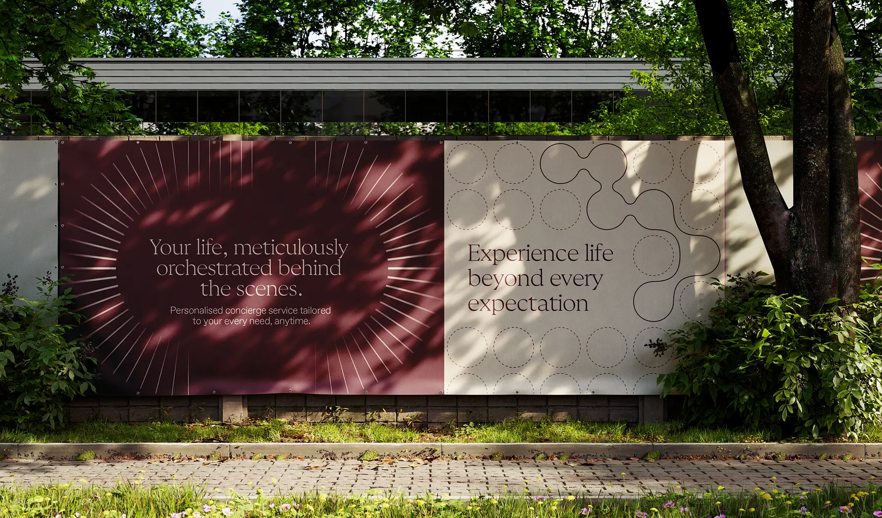
The task before us was clear. To create branding and communication that puts this distinctive idea of “layered living” front and centre.

Interpreting Layered Living.
Elegantly and with purpose.

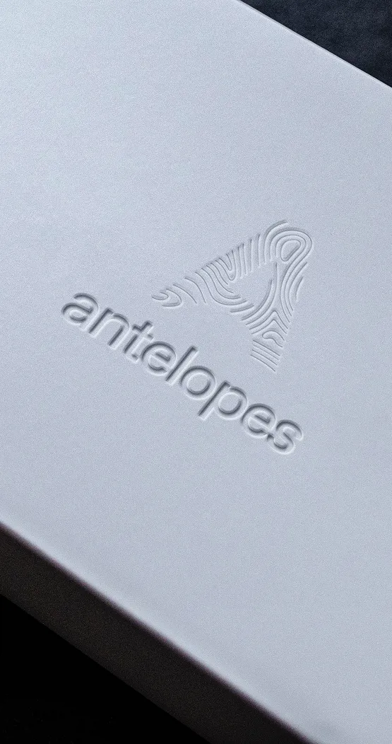
The logo features an “A” constructed entirely of contours, embodying Antelope’s layers. The absence of colour emphasises the dynamic lines and the negative space evokes a sense of mystery.
The logo features an “A” constructed entirely of contours, embodying Antelope’s layers. The absence of colour emphasises the dynamic lines and the negative space evokes a sense of mystery.
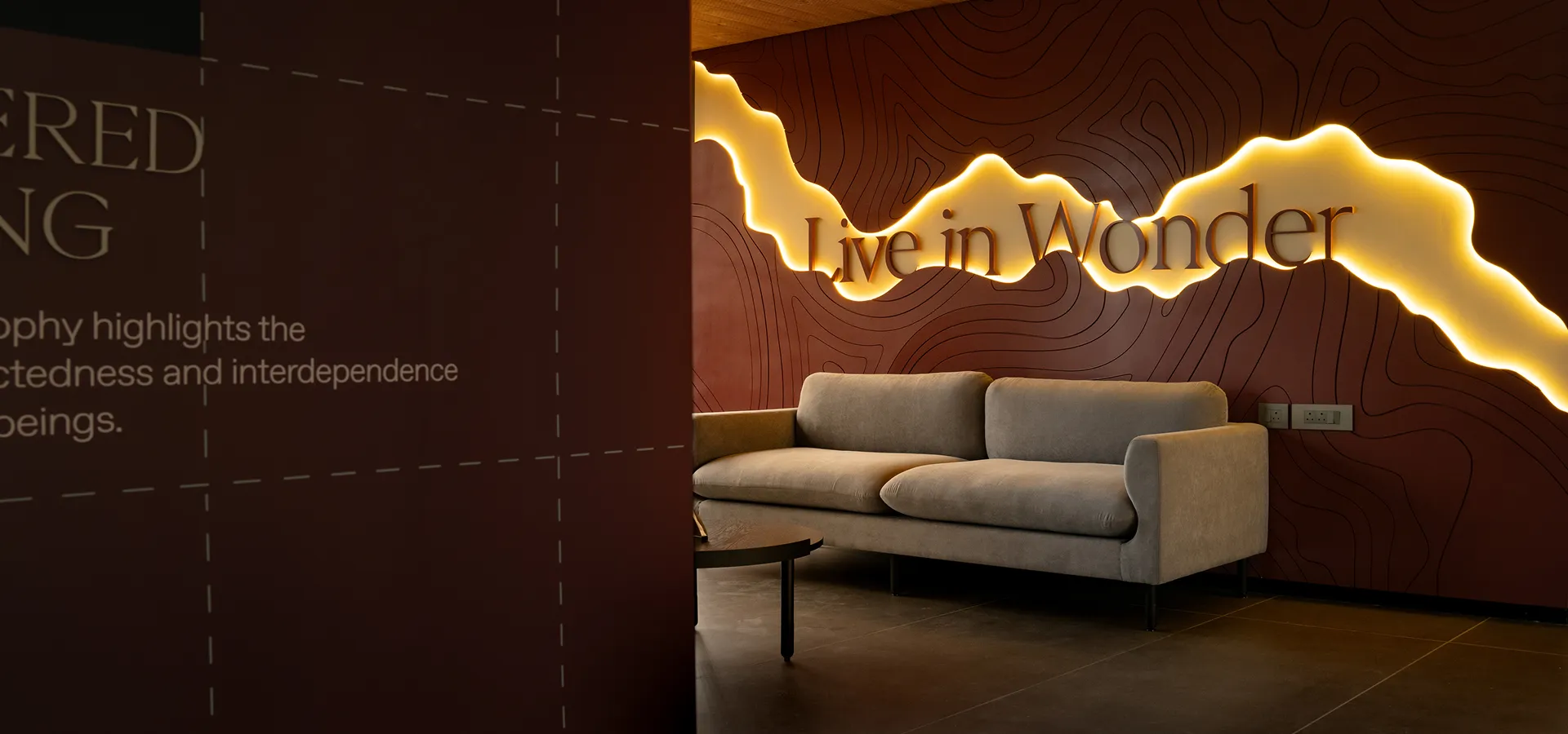
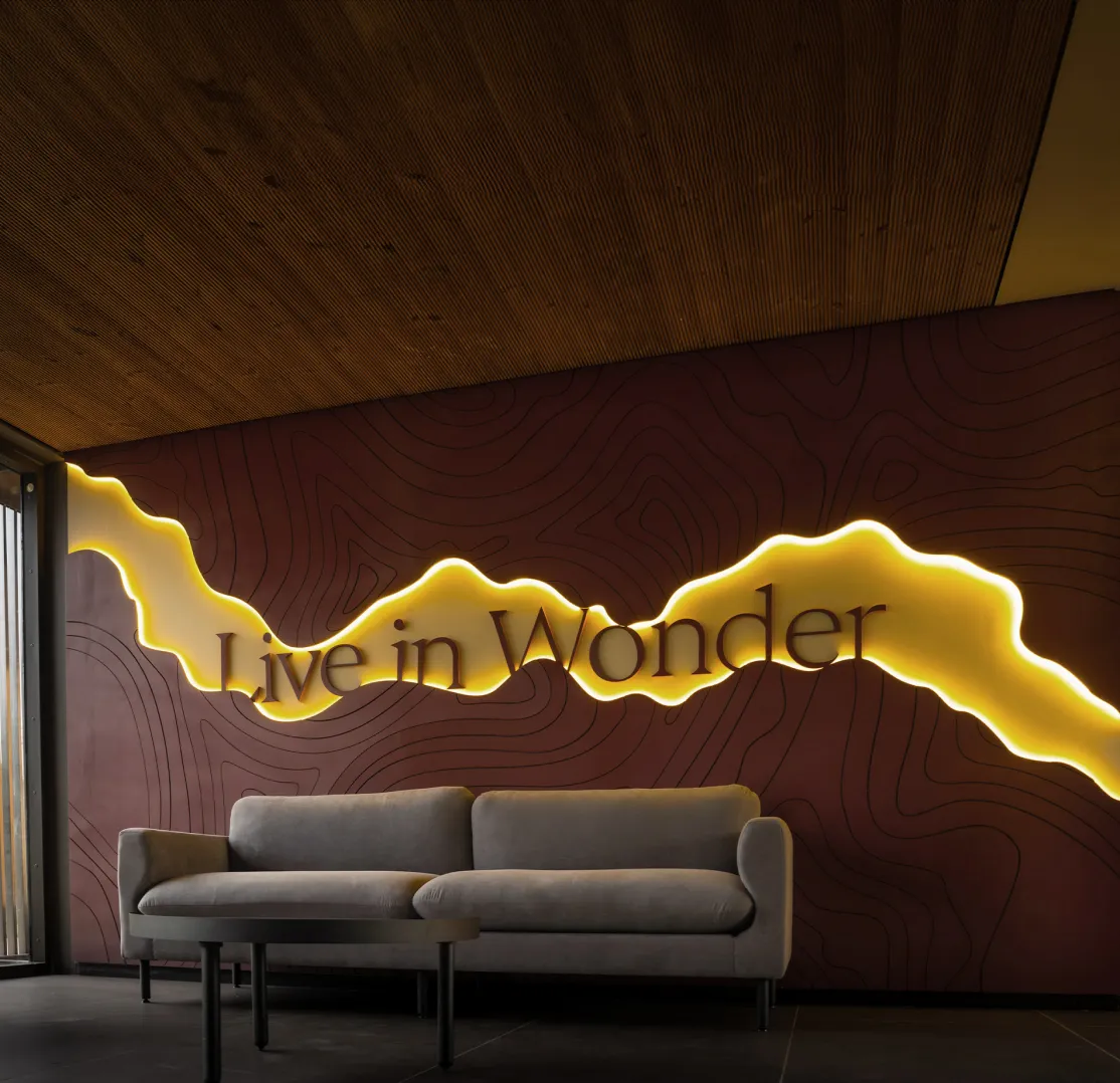
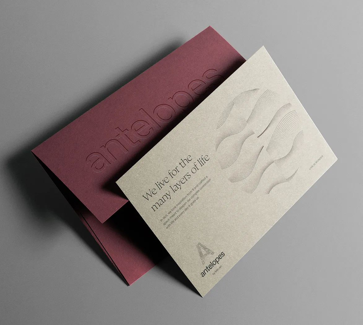
Live in wonder.
A positioning statement that captures Antelopes’ vision for its residents — to flourish in a space where one is constantly inspired by their surroundings. Where one finds joy in the harmonious blend of luxury, nature, and modern living. A statement that signifies a place where every day is an extraordinary experience, filled with moments of beauty and discovery.

The design language leverages lines reminiscent of the Antelope Canyon’s topography to drive in the key theme of layered living.
%20(1).png)
These lines are used throughout branding elements to convey a sense of depth and multitudes.


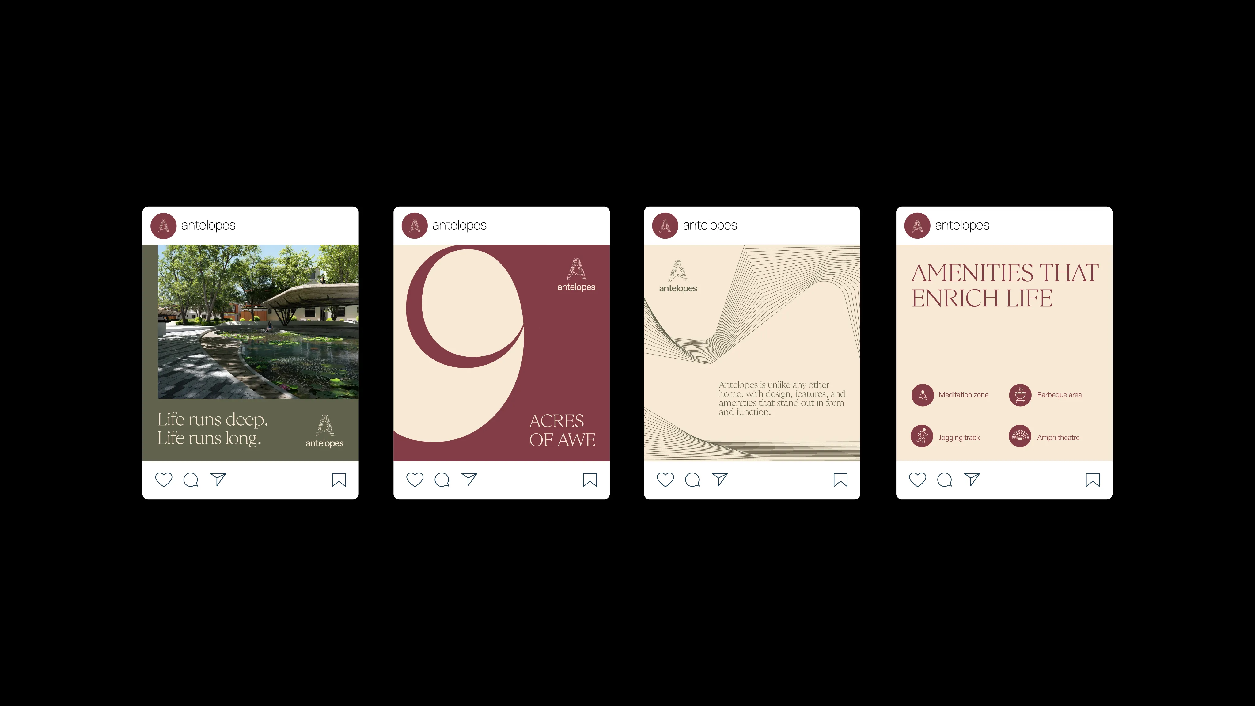
Interactive, Engaging, Informative.
In the brand’s website, we prioritised creating balance between eye-catching animations, interactions, and information-heavy layouts.
It contains a responsive hero section, manually built on Webflow, that depicts Antelopes’ signature contour lines with the characters of the word “Antelopes” animating in — an appropriate prelude for what’s to come.
It contains a responsive hero section, manually built on Webflow, that depicts Antelopes’ signature contour lines with the characters of the word “Antelopes” animating in — an appropriate prelude for what’s to come.
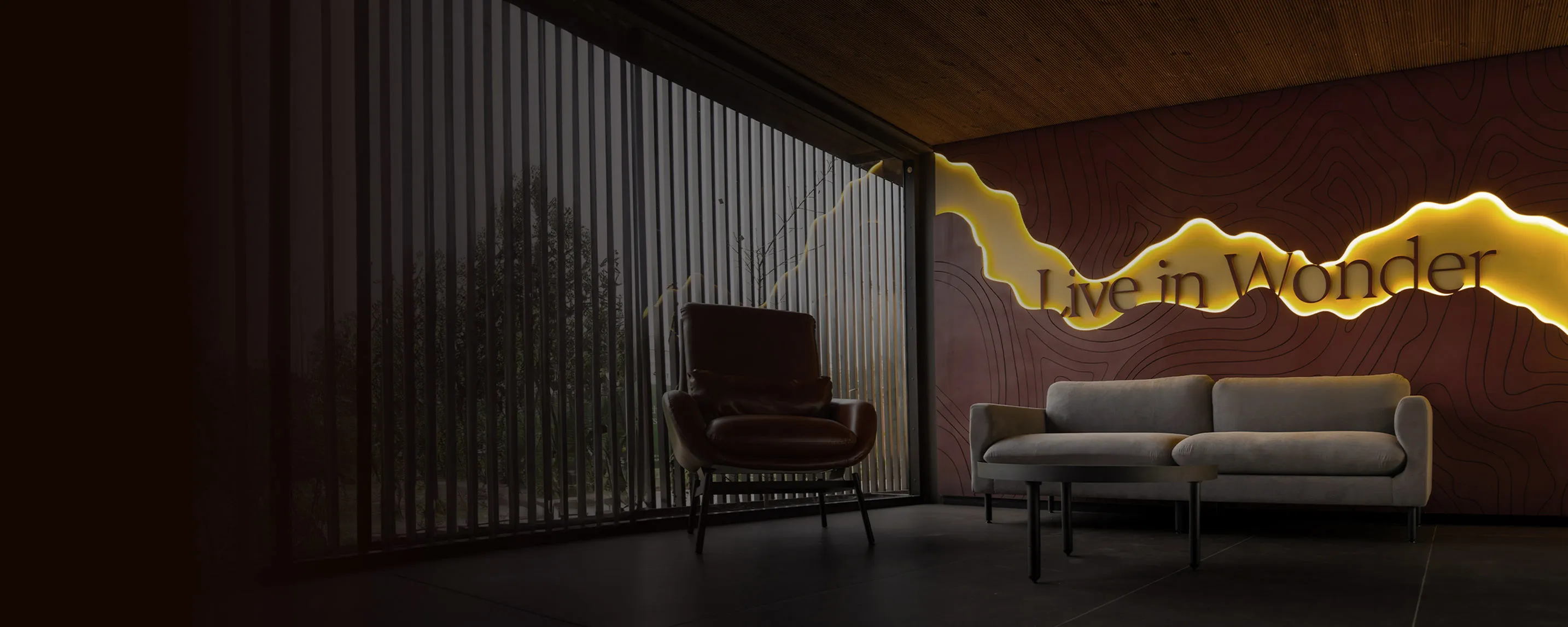
An experience centre that exhibits a smooth extension of Antelopes’ visual identity.
Envisioned with miniature prototypes that were exact replicas of the designed walls.
Envisioned with miniature prototypes that were exact replicas of the designed walls.
The Experience Centre —
a preview of the bliss to come.
An experience centre that exhibits a smooth extension of Antelopes’ visual identity.
Envisioned with miniature prototypes that were exact replicas of the designed walls.
Envisioned with miniature prototypes that were exact replicas of the designed walls.
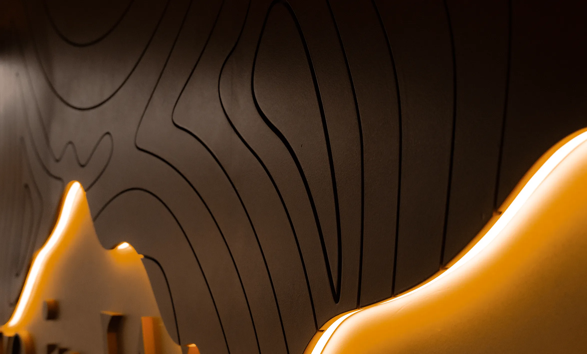
A behind-the-scenes look at how the experience centre came to be — from conceptualisation to its execution.
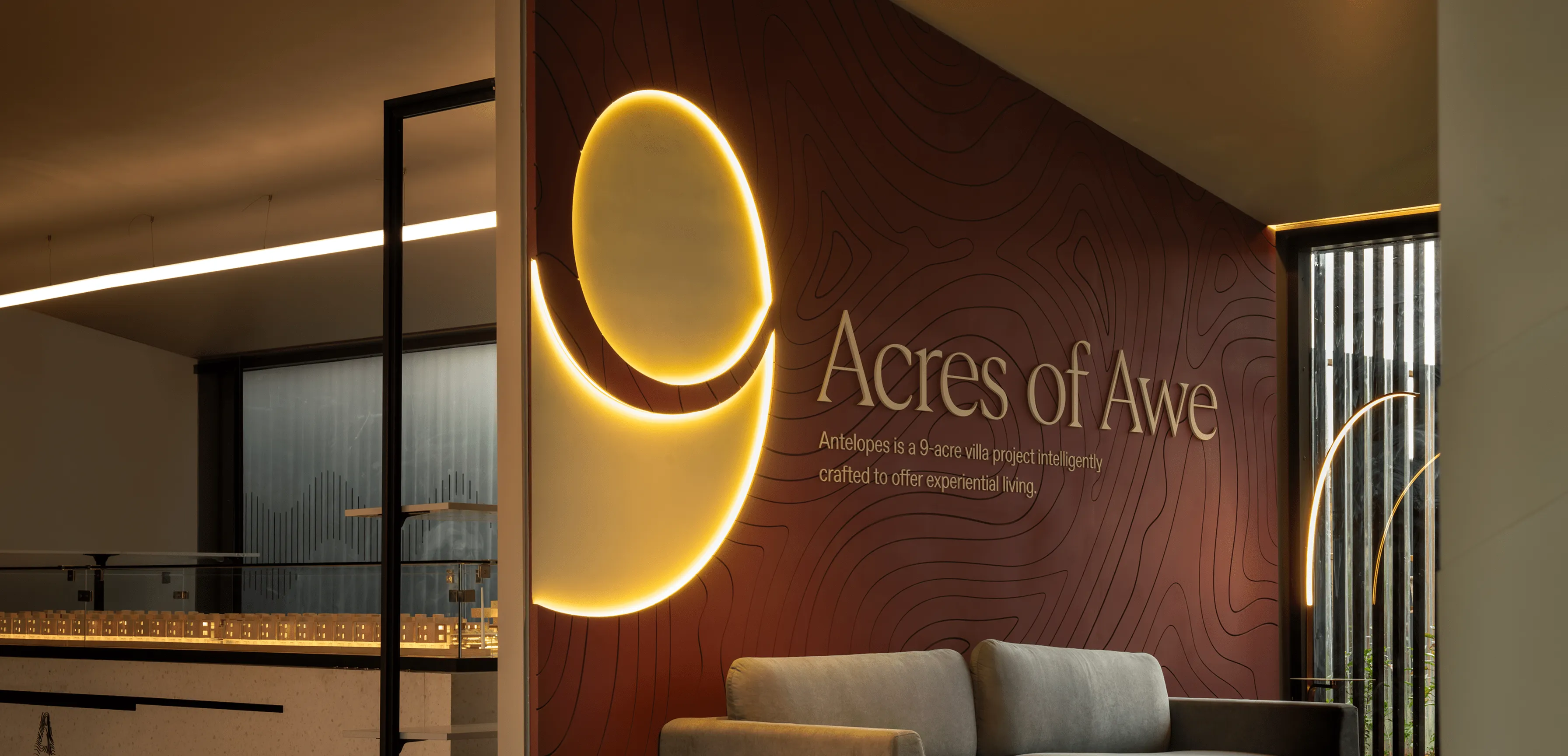
A sensorial experience made with WPC (Wood Plastic Composite) on which each groove was router cut. The use of cove lighting, acrylic letters, and laser-cut glass panels brought in additional depth.
We were left with a space that was minimal and tasteful that evoked a sense of mystery and wonder in its visitors.
We were left with a space that was minimal and tasteful that evoked a sense of mystery and wonder in its visitors.


Our collaborators for this project
2+ Design Collective
Project Conceptualisation & Architecture
View profileMohit Sanchaniya
Renders
View profilePrintree Custom Creation
Print and Execution Partner
View profileRough Paper
Copy Writing
View profileCrafted Pixel Works
Case Study Imagery
View profile