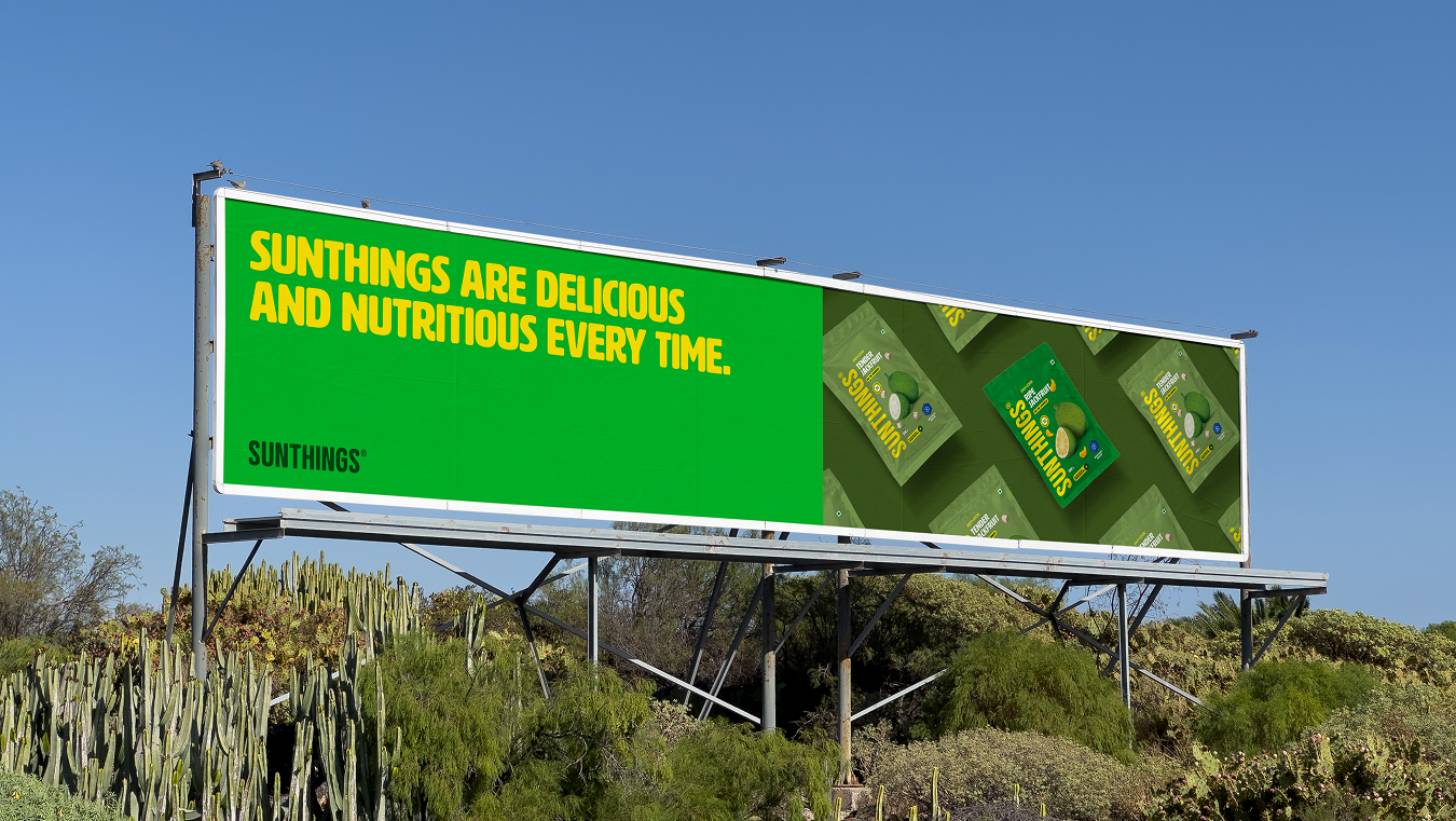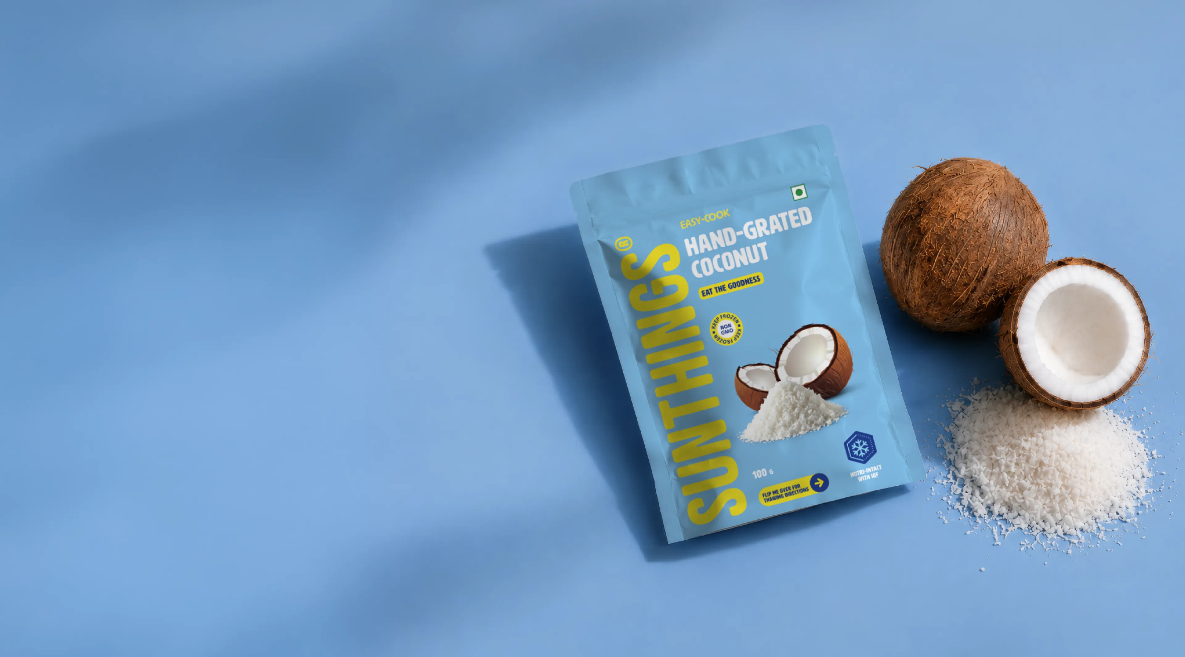
Designing packaging that's as honest (and delectable) as its contents.
Client
Sunthings
Industry
FMCG
Duration
4 months
Year
2025
Scope of Work
Brand Identity,
Packaging,
Digital Design
Packaging,
Digital Design
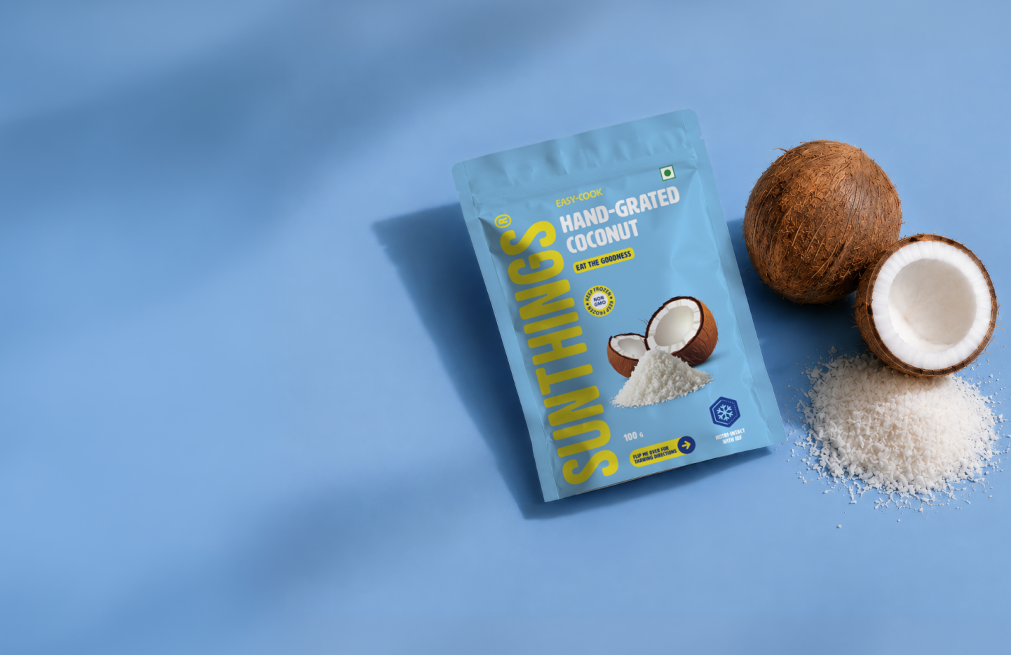
In India, frozen food has a trust problem.
Largely associated with compromise, frozen fruits and vegetables are often viewed as lesser than. Sunthings enters this context with a clear premise: freezing, when done right, preserves produce at its best.
Within a segment that is not clearly understood or trusted yet, we conceptualised a visual and verbal identity where clarity was the whole personality, and not just a footnote.
A brand that speaks clearly without sounding flat.
Starting with the name, "Sunthings" is exactly what it says — produce grown under the tropical sun. Its phonetic similarity to "somethings" opened up a copy register that felt conversational and grounded.
.png)
.png)
Designing with "product-first clarity".
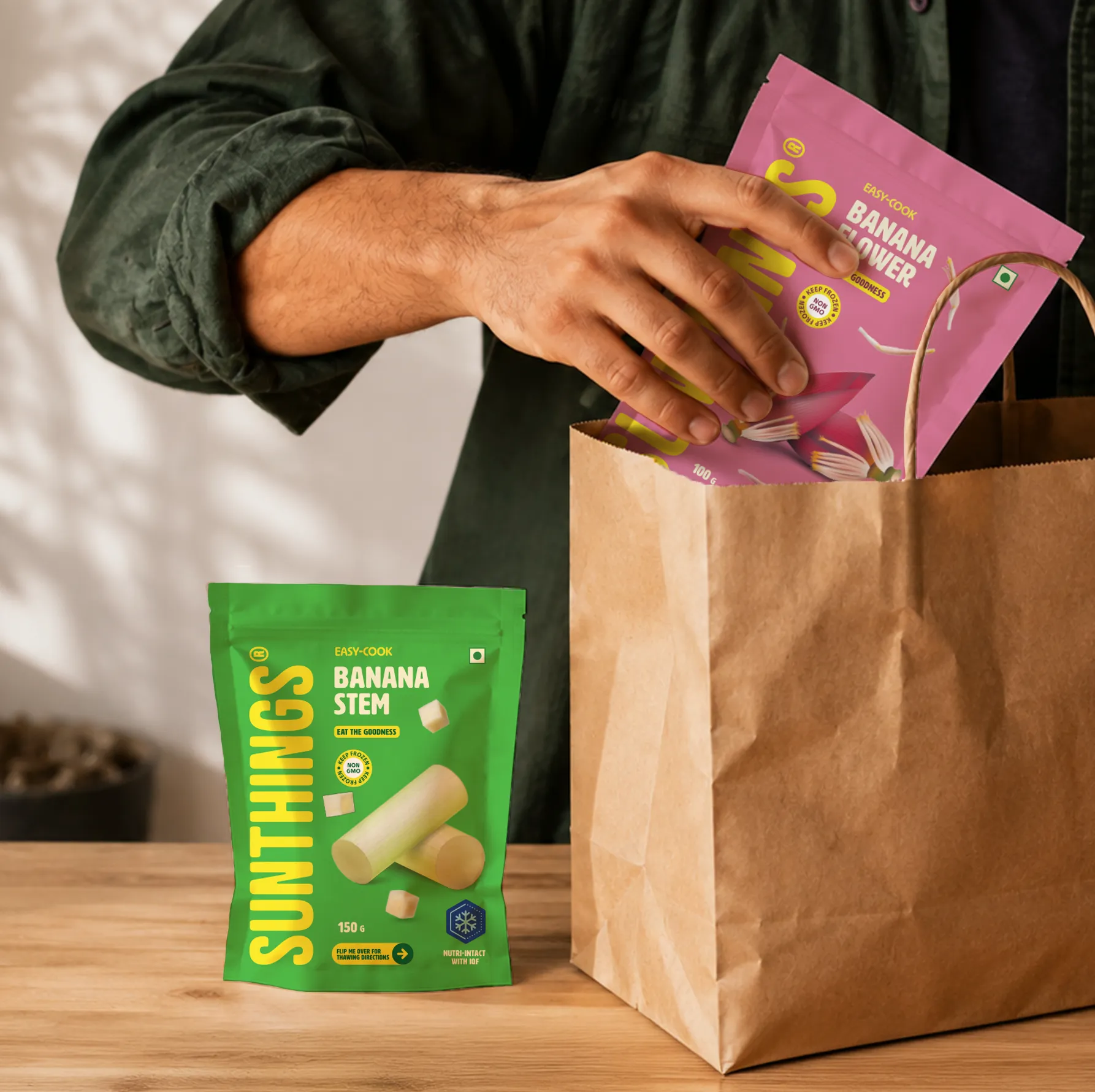
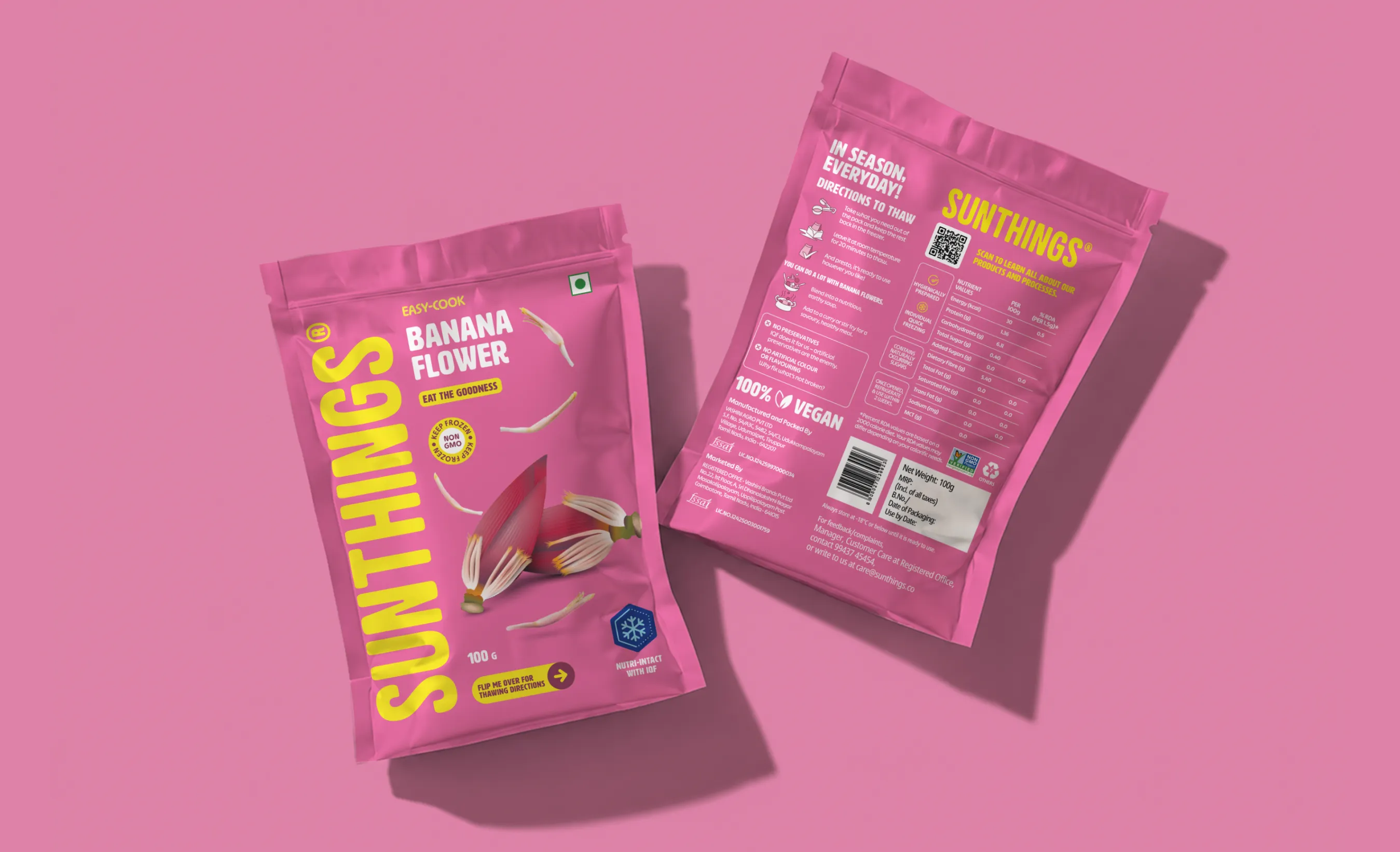
Sunthings uses IQF technology to lock produce at peak ripeness, preserving nutritional integrity without additives. Instead of relying on clinical cues to communicate this on the pack, we designed with "product-first clarity" and stripped it back to essentials: the inherent goodness preserved within.
Packaging
Architecture
Architecture


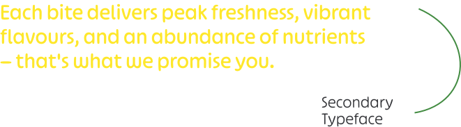
A typographic system that's genuine and friendly.
The system pairs HWT Artz with Ohno Softie. HWT Artz carries primary information — its wood-type character referencing traditional harvesting, bringing a sense of groundedness and authenticity. Ohno Softie handles secondary text, its soft forms echoing the wordmark's rounded edges and keeping the overall tone approachable. Together, they create a clear typographic hierarchy that feels friendly and organic.
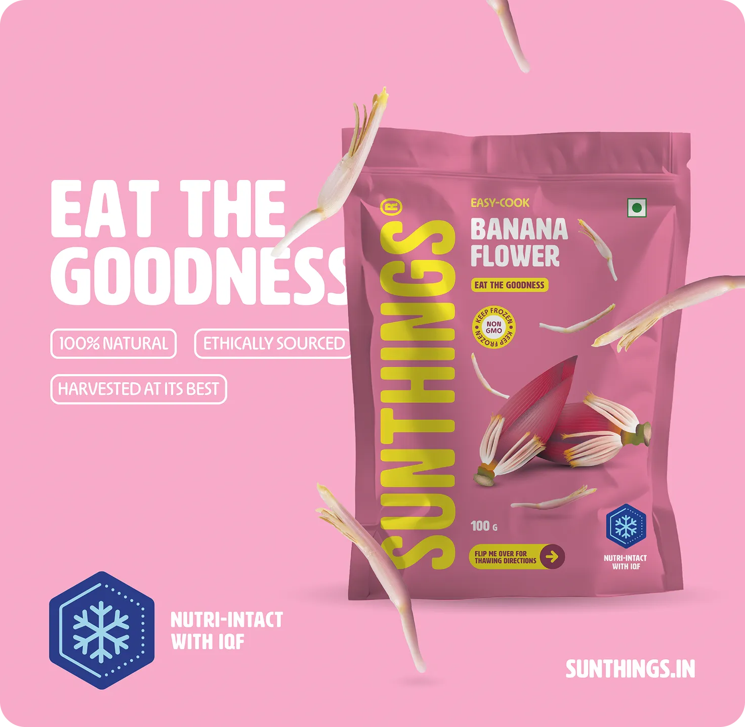
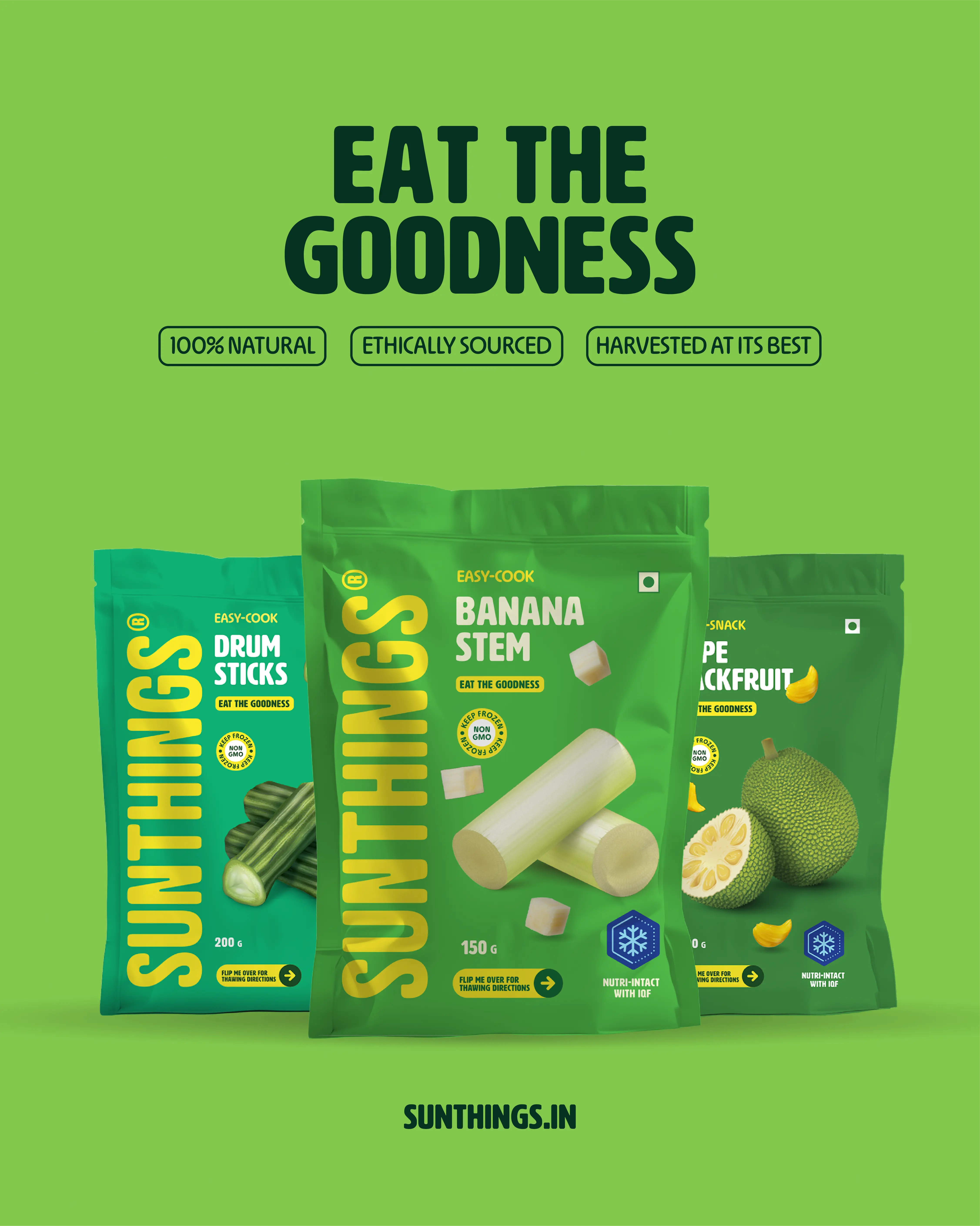

A colour palette derived from the produce itself.
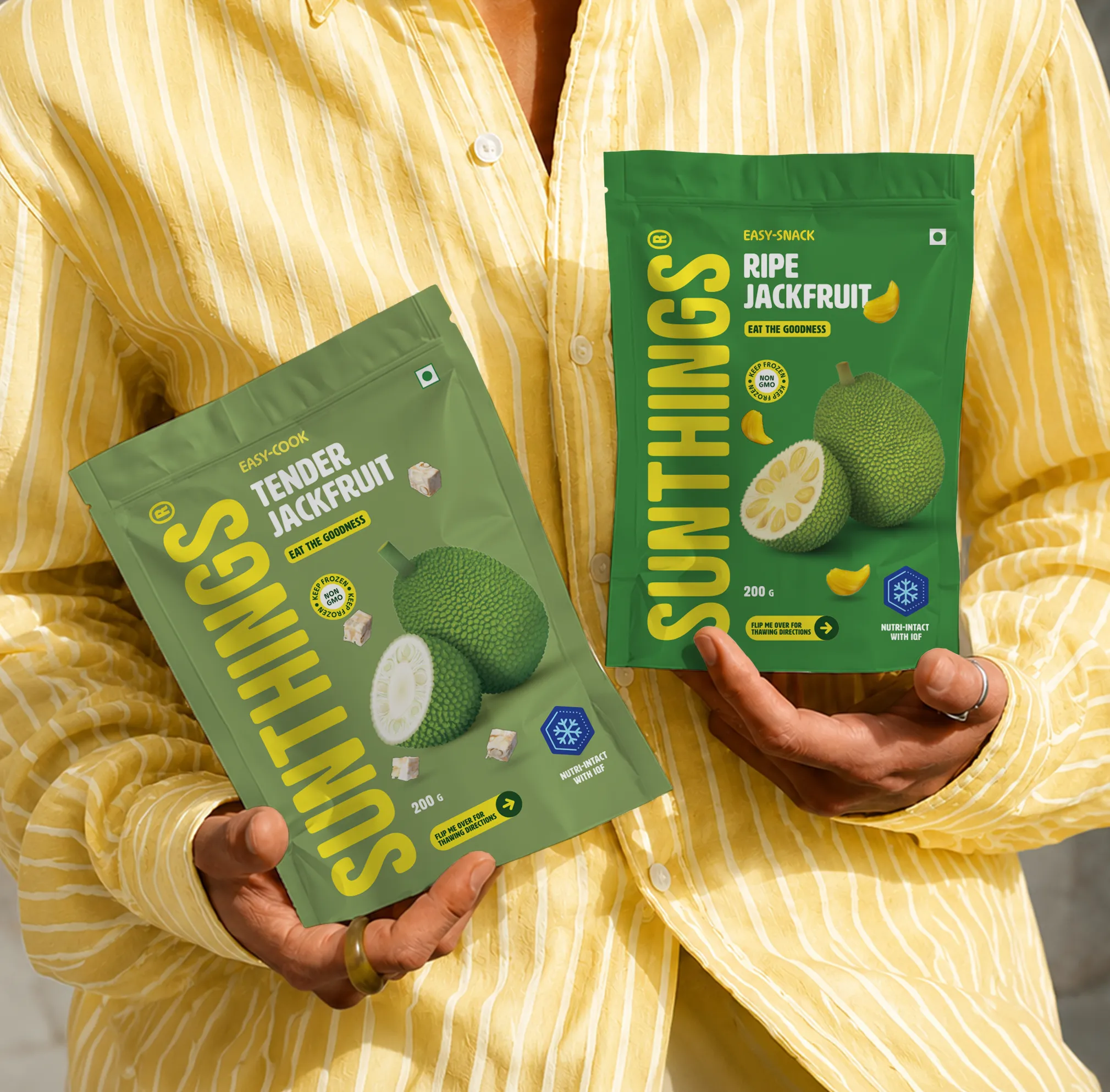
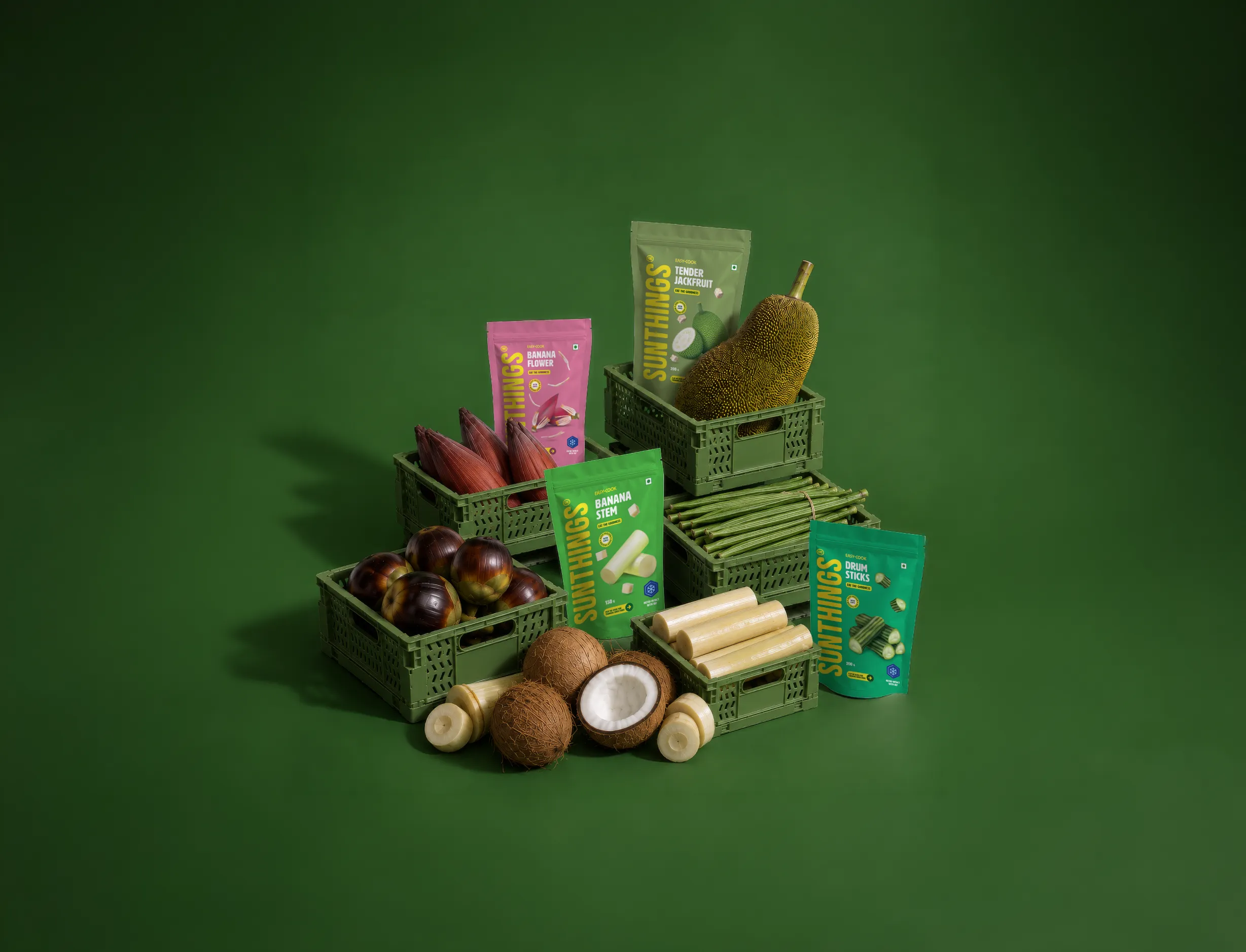
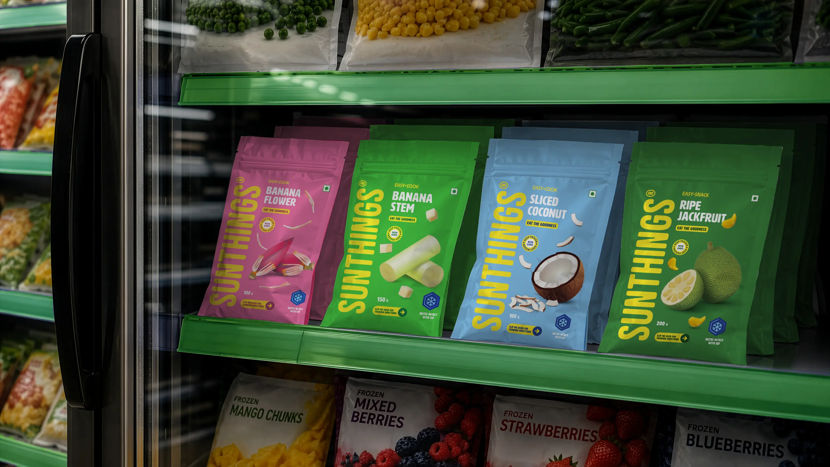
Sunthings offers a focused range of tropical produce. We derived the colour palette from this diverse portfolio, directly correlating the packaging hues to the fruit or vegetable inside.



As for imagery, a deliberate choice was made to use a combination of illustrations and photography.

The soft detailed rendering of the whole fruit captures its natural essence while maintaining a friendly, artistic feel. Complementing this are floating photographic fragments of the produce, adding a layer of transparency and realism.
These fragments showcase the produce cut and cleaned, making its convenience immediately apparent.
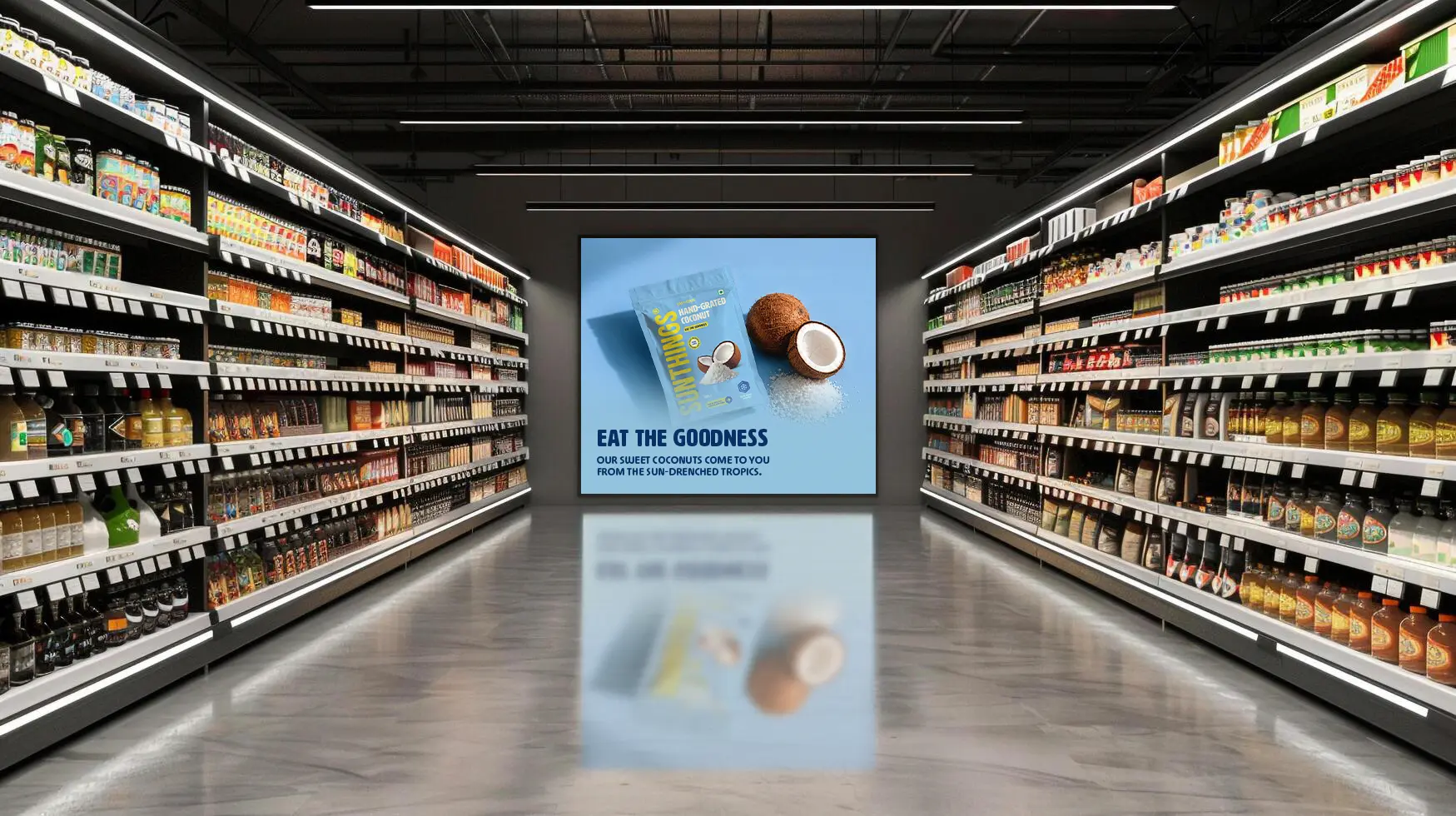
The name, the type, the colour palette, the imagery all point back to the same place: tropical produce, handled honestly, with nothing to hide. In a category still earning its trust, this kind of clarity isn't just a design choice. It's the whole argument.
Eat the Goodness.
Eat the Goodness.